Skip to Content
 

Would appreciate some quick feedback

51 replies [Last post]
Hedge-o-Matic
Hedge-o-Matic's picture
Offline
Joined: 07/30/2008

Hi, all. I tried to set up a mass IM for those who expressed interest in my current project, Vast. That didn't go so well, so I'm making a public thread. anyone who has an opinion, please fire away.

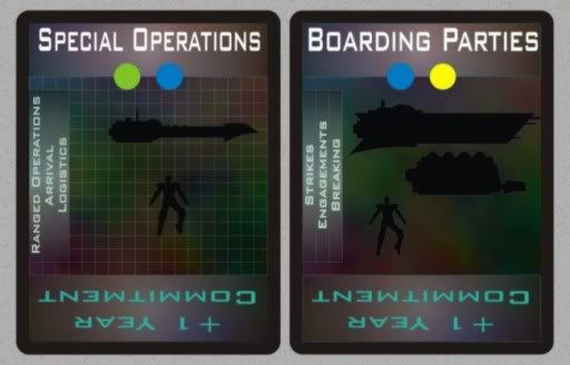
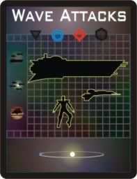
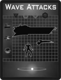
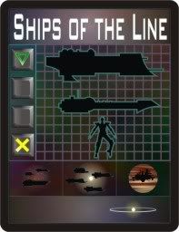
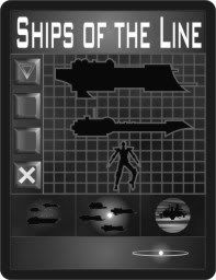
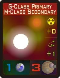
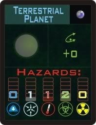
I'm basically done with the combat system of the game, and was working on the design of the cards that drive it. As you all know, the information layout of a card is super-important in smooth play, and getting the card count down can sometimes force compromises on your initial vision -usually for the better, it seems to me.

So, anyhow, the big questions I've got are these:

1.) Are the cards clear enough, as shown? Is the information on them distinct, even though you don't understand it yet?

2.) Does the grid behind the profiles make them more distinct, or less?

Since these are just prototypes, I can change things around easily, it's just tedious, if it affects the whole deck. Any comments would be appreciated!

Yogurt
Yogurt's picture
Offline
Joined: 01/09/2009
Would appreciate some quick feedback

The grid helps, but the figures still need to be more pronounced.

The coloured dots work fine, although I know colour-blindness affects a lot of gamers. I know nothing about colour-blindness, so perhaps those colours aren't affected.

I would find the text on the side easier to read if it was swapped with the "+1 year commitment" text, because the +X Year line seems standard enough (from these cards) that you don't actually need to read it. Perhaps the side text is designed to be visible in a fanned hand of cards?

rellekmr
Offline
Joined: 12/31/1969
Would appreciate some quick feedback

echo

NetWolf
Offline
Joined: 12/31/1969
Would appreciate some quick feedback

Keep the grid, add an 'outside glow' to the figures.

Nando
Offline
Joined: 07/22/2008
Would appreciate some quick feedback

The silhouettes need sharper edges. I have 3 suggestions:
A) Make the background lighter.
B) Make the grid either brighter or a smidge thicker. (My choice.)
C) Put a white outline on the figures.

For the dots... If the order doesn't matter, I suggest using position to supplement color as an identification mechanism. For example, have the dots always appear in Blue, Green, Yellow, Red order and just black out those that aren't applicable on a given card. If order does matter, you might consider this same scheme, but also put a symbol in the dot to denote ordering (like A and B, or 1 and 2, etc.).

The commitment text makes it look like you're intending to do offset stacking to show a cumulative commitment value. (Which is cool.) If you used only numbers for this, you wouldn't have to translate it into German later. ;) I suppose there are other phrases that will appear there, though.

Brykovian
Brykovian's picture
Offline
Joined: 07/21/2008
Would appreciate some quick feedback

Nice cards. :-)

I agree on using an outer glow on the figures.

On the color-blindness point with the colored dots ... you could make each color a slightly different shape if that doesn't impact gameplay. Green circle, blue square, red triangle, etc.

-Bryk

Hedge-o-Matic
Hedge-o-Matic's picture
Offline
Joined: 07/30/2008
Would appreciate some quick feedback

Thanks for the feedback!

Dots: I'm going to make each a unique shape, as well as in a unique position along the line, to help colorblind players. Even with color vision, those green and blue dots look too similar.

Outline: Funny, they do have outlines, but the vector lines show up far more crisply than do the pixel output lines. Gotta thicken those up! when they call something a "hair line", they aren't kidding around!

Side text: The side text needs to be readable, since the upside-down text is pretty much standardized, and the number tells players all they need to know to use it. The side text, placed upside-down, would be really tough to read.

Grid: Let me work on this. The color could also be a factor. It's amazing how much of a difference in visibility the grid has when turned different colors.

Thanks all! I'll change these up, and present the new versions. It's important to have the cards very functional, since I want combat to be pretty quick, and there are a lot of things going on.

Yogurt
Yogurt's picture
Offline
Joined: 01/09/2009
Would appreciate some quick feedback

Just to clarify, when I suggested moving the traits from the side, I actually envisioned them being *right-side up* on the bottom on the card.

Hedge-o-Matic
Hedge-o-Matic's picture
Offline
Joined: 07/30/2008
Would appreciate some quick feedback

yogurt wrote:
Just to clarify, when I suggested moving the traits from the side, I actually envisioned them being *right-side up* on the bottom on the card.

The orientation of the text is to make it clear when you choose to use this aspect of the card, as opposed to the colors, or other traits. The cards are placed face-down (like cribs in cribbage) in groups. The topmost card of the group shown the elements you'll use from that fleet (illustrated by the silhouettes and the name of the card), and this card must show the color symbol matching the location of that fleet. Other cards after this are upside-down, showing time committed to this strategy with these forces (increasing their effectiveness). Other right-side up cards give a bonus only if they match the strategic "phase" of the war that controls that mission, shown by the three listings on the side.

It sounds complex, I know, but, given that it's almost all visual, it takes a lot of words to explain it...

I'm still working on the new look of the cards. Stay tuned!

soulbeach
Offline
Joined: 12/31/1969
Would appreciate some quick feedback

Great ideas have been suggested. Personnaly, i cannot see the figures at all :(. For the "commitment", you could use a symbol and a number, indicating all the info you need to communicate:

http://www.lastship.ca/images/

By the way, how did you insert the image directly in the post??

w0rf
Offline
Joined: 12/31/1969
Would appreciate some quick feedback

Not much to add at this point, but the grid is not the problem, the contrast is the problem. You have black silhouettes on a dark-colored background, there is not enough contrast to help them stand out.

It is better with the grid than without, but the background needs to be lightened, and/or the figures need to be either outlined or shadowed.

Hedge-o-Matic
Hedge-o-Matic's picture
Offline
Joined: 07/30/2008
Would appreciate some quick feedback

soulbeach wrote:

By the way, how did you insert the image directly in the post??

The IMG tag points to a web page that holds the image. I use Photobucket, but Imageshack is becoming very popular. These sites provide the IMG link info, and you just past it into your post.

Yes, I resized the image. It was irritatingly large.

Hedge-o-Matic
Hedge-o-Matic's picture
Offline
Joined: 07/30/2008
Would appreciate some quick feedback

Okay, here's an updated card, with a black and white duplicate so we can consider full color blindness issues.

Changes:
>Color dots replaced with icons in unique locations, with unique colors,and unique shapes.
>The grid is a bit thinker, and makes the figures stand out better.
>The silhouettes have a bolder outline.
>The commitment in years is shown as an icon (the planet going around the sun a complete orbit... geddit?).
>The War Phase bonuses along the side are now icons as well.

I hope this is cleaner. The JPEG is a bit blurry, but the icons should all look distinct. And no, the ships in the tiny side icons are not meant to indicate particular types of ships (though they are really tiny silhouettes), they're just meant to give the impression of generic fleet activity.

More feedback, please!

soulbeach
Offline
Joined: 12/31/1969
Would appreciate some quick feedback

It looks much better! And the icons look good too, making all of this much more international and accessible. Good job!

Anonymous
Would appreciate some quick feedback

The coloured dots are now less clear than they were before. This is because you've increased the contrast on absent dots (by putting in the black/gray shadows), so they look similar to the present dots which are already low-contrast due to colour-blindness (in my case, the red one).

The obvious solution is to lose the shadows (while keeping the unique position for each attribute) but you may have a better idea. At the very least, make all the shadows the same colour.

soulbeach
Offline
Joined: 12/31/1969
Would appreciate some quick feedback

recidivx is right...Maybe simply have these forms be full instead of having a hollowed symbol in the middle.

Maybe you could also use a vertical oval for your red circle, and then add a grey stroke around all your "roundish" symbols on the left side of the card, distinguishing them even more.

FateTriarrii
Offline
Joined: 01/04/2009
Would appreciate some quick feedback

Replied further down the page. Sorry about this post.

OutsideLime
Offline
Joined: 12/31/1969
Would appreciate some quick feedback

You're getting there... I would use an "X" instead of a hexagon, though.... it is a much more distinct shape when compared to the circle. Putting each dot on a black background will provide the contrast you need for perfect clarity. You can keep the unique position too, by leaving circles blank. Check it out:

... and the grayscale version for colour-blind proof...

~Josh

soulbeach
Offline
Joined: 12/31/1969
Would appreciate some quick feedback

Thats pretty cool josh!

But i would also add something to the side symbols, similar to what you did witht the colored ones, to make them stand out.

FateTriarrii
Offline
Joined: 01/04/2009
Would appreciate some quick feedback

Maybe you could put numbers next to the bonuses along the side (so you can keep the same nice graphics).

But it looks great! Good luck with the game!

Hedge-o-Matic
Hedge-o-Matic's picture
Offline
Joined: 07/30/2008
Would appreciate some quick feedback

Josh: That does look cleaner, with the circular buttons. The reason I didn't do that in the first place was I was afraid it would look a bit "X-Boxy", if you know what I mean. But it looks pretty good. I agree on the X being more distinctive.

recidivx: Glad to have feedback from someone with actual color-blindness, if you don't mind me saying so. I used to have three people in my playtest group with one form or another of color blindness (if you can believe it). Ah, the good old days!

I'm afraid your post is a perfect example of why this is such an important consideration, desing-wise. I think what you're interpreting as "shadow" are the active colors, while the inactive colors are shown as black shapes.

Are the designs Josh posted clearer?

I'll await your feedback before sending another round for evaluation. This is very important, since these symbols are to be used on all componants, especially the color coded symbols.

Soulbeach and FateTriarrii: I'm going to make the side icons more distinct by placing a number (or letter, or something) with them, and giving each a box to seperate it from its fellows. In actual game terms, though, there are only three sets of these side icons, so it isn't like there's a huge mix you have to individually interpret because they can appear in any combination. They can't. The icons will be in one of three triplets.

Nando
Offline
Joined: 07/22/2008
Would appreciate some quick feedback

Just for what it's worth, when I'm doing shapes for symbols, I always like to do:
1 edge: circle
2 edges: cat's eye (or football or whatever it's called)
3 edges: triangle
4 edges: square

Anonymous
Would appreciate some quick feedback

Josh's design is somewhat clearer, though on an aesthetic level I think 'X-boxy' is a good description. But still on the red one, the bright circular rim stands out much more than the red object so the strongest cognitive effect is "outline circle => absent attribute". You could make the rim a darker grey, or put brighter outlines on the shapes themselves so they stand out more.

Hedge-o-Matic
Hedge-o-Matic's picture
Offline
Joined: 07/30/2008
Would appreciate some quick feedback

Got it! Making changes now! Stay tuned!

Hedge-o-Matic
Hedge-o-Matic's picture
Offline
Joined: 07/30/2008
Would appreciate some quick feedback

Here's the third style card in color and grayscale. The color icons now go down on side, to make them easier to see in a fan, while the three phase icons are now larger, and along the bottom. I think these are clear enough without further numbers, now. The title is larger, and the silhouettes are far more distinct. Comments?

Nando: I use a similar system of symbols, normally. I use a small circle (or solid-filled circle) for one, a hollow circle for two, a triangle for three, a square for four, and a five-pointed star for five.

FateTriarrii
Offline
Joined: 01/04/2009
Would appreciate some quick feedback

I like it. I can't really think of anything more to do to them, they look good... One possiblity is that the square (which is not in your nice diagram right now) might blend in with its background. But that should be easy to work around. looks good! :)

Hedge-o-Matic
Hedge-o-Matic's picture
Offline
Joined: 07/30/2008
Would appreciate some quick feedback

Then that's the final look of the combat cards. Thanks all!

Hedge-o-Matic
Hedge-o-Matic's picture
Offline
Joined: 07/30/2008
Would appreciate some quick feedback

Once again, I'd appreciate comment on how to improve the functionality of these latest cards. This batch are from the solar system generator, which consists of three decks of cards: Solar Primary (suns), Habitation (worlds to be colonized), and System (other planets used for resource gathering) cards. EAch deck will have 100 cards, like teh Combat deck does.

An example of the three cards is given below. These are meant to "nest together just a bit, to save space, but I'd consider reworking it to nest further (overlap more), but, fankly, there's not a lot of dead space on the cards without getting very cramped, thus their current look.

Thanks in advance!

Nestalawe
Nestalawe's picture
Offline
Joined: 08/07/2008
Would appreciate some quick feedback

These are looking nice Hedge!

A few quick thoughts -

- To keep the colour scheme the same, you may want to swap around the blue and white(?) icons on the Planet and System cards, as the other three colours match up. Do these directly relate to eachother in any way? The colour scheme tends to indicate so.
- I'm not a big fan of the title 'squished' font, though it looks better in its normal version, but thats just personal preference...
- It may be worth changing the colour of either the Planet or System headings - if they are both blue it will be easy to get them mixed up.

Otherwise, looking good ;)

Zzzzz
Zzzzz's picture
Offline
Joined: 06/20/2008
Would appreciate some quick feedback

I agree with Nestalawe, the cards are looking very nice!

Not sure if it is just me, but the Planet card seem to look darker or dimmer than the other two cards. I guess it just does not looked as polished as the other two. Or maybe it is just something with the colors that makes it look darker/dimmer on my screen.

One other thing to consider, the bars located on both the Planet and System cards might need to match more closely in size/shape. For instanace the System card bar contains 12 *ticks*, while the Planet only contains 6 *ticks*. And the numbers on the System Card seem to look larger than the numbers located on the Planet card. Is there a reason for these differences? Would it hurt or hinder anything in the game if you made the bars all look like the one on the System card?

To me keeping the look and feel of all the bars located in your game the same, though you might not need them the same, will give the cards/game a more integrated look. Even if the bars on both cards have nothing to do with each other, just getting them to look and feel the same on each card would be a nicer look in my opinion.

As I said earlier, they cards are looking nice, so take what I stated with a grain of salt.

TheReluctantGeneral
Offline
Joined: 12/31/1969
Would appreciate some quick feedback

I agree with the others; they look very cool, however I also agreed with the niggles they pointed out as well. Apart from that my only comment would be that I felt that perhaps you could have incorporated a starfield background on some or all of the cards in some sections of the cards.

Since the scope of the game is interstellar, I think this might help to push the theme a little more. Perhaps you tried this and found the result too cluttered?

EDIT:

P.S. I also feel that while the red 'lens' effect on the primary star card looks very nice, it does look a bit incongrous next to the universally dark background of the other two cards. Given they are supposed to be a set layed out together, this might cause me a bit of unwanted eye strain.

Syndicate content


forum | by Dr. Radut