Skip to Content
 

Critique my prototype layout

11 replies [Last post]
questccg
questccg's picture
Offline
Joined: 04/16/2011

Here is the prototype card layout for "Crystal Heroes".

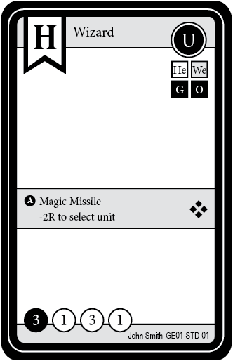
Obviously I'm not very "excited" by this layout, the LARGE "white" area will contain "artwork" so it will be full-length in terms of artwork size. This I like, since it will allow players to get a good feel for each character depicted.

The active ability (A) will be a transparent layer that will colorize the ability according to the color of the card.

Please tell me what kind of improvements I could do to make this card look better...

Many thanks!

Note: I included the bleed + the cut line so people (myself) will be able to cut the prototype cards without any difficulty (as asked by pelle).

questccg
questccg's picture
Offline
Joined: 04/16/2011
What bugs me

The problem I see is with the TOP RIGHT-HAND-SIDE: I don't like this layout for the attack directives...

If anyone has some inspiration on how it can be displayed OTHERWISE, I'm all ears! :D

Thanks.

Update: Inspiration STRUCK and I got something I think will look pretty good.

I'll post an update tomorrow night... I have to work on the icons for each Race. I have all nine (9) SVGs but need to play around with them in Illustrator... Like I said tomorrow!

Cheers everybody!

HPS74
Offline
Joined: 01/06/2009
Why not use the 'Crystal' theme

You could use the crystal shape and gradients for nice, easily identifiable 'race' cards.

Eg - rather than the top left corner having a flag drop down, use a crystal in the colour for that race / character.

Likewise the border shape. Jutted edges may add to the crystal theme?

Just my thoughts :)

questccg
questccg's picture
Offline
Joined: 04/16/2011
Updated version

This is version 2.0 of the card...

questccg
questccg's picture
Offline
Joined: 04/16/2011
Here is a version of the rendered card

WIP: A sample of the Human "Wizard"!

This is still not 100% complete (missing a nice separator).

HPS74
Offline
Joined: 01/06/2009
Looks good - who did your

Looks good - who did your artwork? I'm looking for a concept artist

limalima
Offline
Joined: 06/01/2013
Looks good!

Just have one question as I am a budding designing :)

Is the area with the active ability in the center due to other cards which have longer descriptions and will take up more of the bottom of the card? Is there a specific reason it is not closer to the bottom? Was just curious as it sticks out (Which I assume is the reason) and covers half of that great art!

questccg
questccg's picture
Offline
Joined: 04/16/2011
Don't tell anyone...

limalima wrote:
Is there a specific reason it is not closer to the bottom? Was just curious as it sticks out (Which I assume is the reason) and covers half of that great art!

This is supposed to be a "secret" but I'll tell you anyways:

The game uses dry erase markers and players WRITE on the cards themselves. The White "Text area" is use for marking stat adjustments and ability effects.

And yes, these cards will be made of plastic.

I have tested the cards and they work fine - you just need a sufficiently large area to be able to "write" on.

Update: Also the artwork is still "visible" even though pale... This is obviously so that when you write you can understand what it is you are writing. So in one of my threads (or Blog) I mentioned that ONE of the hard parts (since this was originally to be a DS Video Game) was that there was a LOT of mathematics.

This White "Text area" will be used to compute modifiers and stat adjustments... The whole "mathematics" part that would have been transparent in the Video Game.

As I have mentioned this game is a "filler-type" game and lasts only about 5-10 minutes per game. It is comprised of several quick rounds... If it gains popularity and I can make the whole thing "profitable" (enough to say that I can invest in making a Video Game) well then maybe there could be an Android app that could get made... But that is FAR away in the future for the moment...

Update 2: I also believe that I have NOT seen cards with FULL layout - that are blocked out as I have done in this layout. Usually the bottom portion is reserved for writing on an area where there is NO IMAGE. I think this will allow my artist to produce nicer (larger) images for the cards!

limalima
Offline
Joined: 06/01/2013
Your secret is safe :)

That makes sense. I knew there was a reason but thought I was overlooking it. That is a neat idea!

Aren't plastic cards going to run the price up on the game?

I have always wanted to implement plastic cards a la Gloom for a kind of time travel sort of game which layer changes a fragment of time but that is beyond my scope.

Thanks for breaking it down to me. Looking forward to how things go from here.

questccg
questccg's picture
Offline
Joined: 04/16/2011
Actually the price is attractive

The key thing is that there are ONLY 12 cards to a deck. That means that the "thickness" of the deck is rather small. Players can have a bunch of cards with them and "deck build" before a game...

Researching via the Internet, I have found a price of 12 cents per card! The Game Crafter (TGC) charges 9 cents for paper. For 3 extra, I get plastic... Really a GREAT value.

So I think this solves the whole "mathematics" issue and it makes for some real nice cards...

questccg
questccg's picture
Offline
Joined: 04/16/2011
Here is a another sample of a rendered card

WIP: A sample of the High Elves "Phoenix"!

As you can see abilities can affect cards outside your race... In this instance it makes the Orcs (Red - Fire) think: "Come on, let's FRY this BIRD!!!" Hehehe...

questccg
questccg's picture
Offline
Joined: 04/16/2011
A revised version of the initial Human Wizard

WIP: A sample of the Human "Wizard"!

This one is 100% complete (add the unit type and some minor effects).

Syndicate content


forum | by Dr. Radut