Skip to Content
 

Latest version of the character sheet. Please comment.

7 replies [Last post]
OgreFoot
Offline
Joined: 01/20/2017
BeforeandAfter150.jpg
DragonWizard.jpg
AngelDemon.jpg

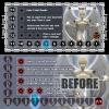
Hello everyone, I have a new version of the character sheet and I value all opinions. I am in the final stages of the game, final changes to the look and feel of the game. Here is the character sheet.

Description:

- 15 through skull is the health counter, a meeple is placed on 15 at the beginning of the game.. Skull = death
- The blue shard lightly covering the 7 is an indicator as to when you can use the blue vorpal shard during the game.
- The sides of the card are reminders to where the attack and defense zones are.
- The 4 darkened boxes are the one time use ability. A cube is places on each start to indicate it is still available.

What do you think of the look and feel. The organization and positioning of the different items.

Does it look too busy? Any feedback is welcome

****Edit****
It was suggested on twitter I put up a before and after, so here is that as well.

scott.pate
scott.pate's picture
Offline
Joined: 06/01/2017
The card looks really great

The card looks really great to me. It seems like the player has a lot of information available to them on their sheet and it is a very useful card to have as opposed to some games that have character cards that you never really do anything with.

Very nice job.

OgreFoot
Offline
Joined: 01/20/2017
Thank you!

Thank you for the feedback, I appreciate it very much! Yes, the character sheet in Gods of TYN HARRA is a big part of this game. When you see you have spent all of your abilities and there are no more cubes on it, you get a sense of "Did I spend my abilities too early?" I love that part about the game.

sheeptree
sheeptree's picture
Offline
Joined: 03/15/2017
The new design looks good to

The new design looks good to me on the computer. It looks clean and easy to read and it has all the information the player would need. The only issue I have with it is that the skull was a little hard for me to see at first glance but that could just be the sizing of the image. Have you tried printing it at its intended size? You might want to do that to make sure everything is still clearly readable.

questccg
questccg's picture
Offline
Joined: 04/16/2011
Not that this is a bad thing...

But I find the Character Sheet to be too "mono-chromatic". It's very GRAY and not very inviting. And you are featuring an "Angelic" character, I would choose WARMER colors like "Yellows" or "Cyan" (kinda cooler -- but I think it would look okay).

That's my feedback: "Make it more COLORFUL and not so Gray and dull..." In comparing the Before and After, I prefer the "After" version.

However I still think you have work to make the sheet more appealing in terms of colors and hues.

That's my feedback... work on the colors (too much B&W).

tikey
tikey's picture
Offline
Joined: 03/31/2017
It's looking much better. I'd

It's looking much better.
I'd recommend you to try a flatter approach by getting rid of the border strokes. For example the rectangles in the middle, they don't need the black outline, just make them flat. The stars should look much cleaner without the outline too, just make them white so the contrast makes them stand out on their own.
Also the typeface for the description should be less flashy and more easy to read. It's better to go for function rather than style with long text.

OgreFoot
Offline
Joined: 01/20/2017
All wonderful thoughts!

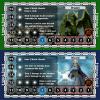
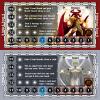
Thank you everyone for your suggestions. As you can see they were good ones. Here are the latest versions of the character sheets.

questccg
questccg's picture
Offline
Joined: 04/16/2011
Have you tried BRIGHT YELLOW???

For the Angel character sheet?? I still think "gray" is too bland. But the Demon in Red looks real cool, the Green Dragon and Blue Wizard also look much nicer...

Maybe trying YELLOW for the Angel would be more appealing... Just a suggestion!

But the other colored sheets look pretty cool!

Syndicate content


forum | by Dr. Radut