Skip to Content
 

What do you think about these *sample* cards?!

8 replies [Last post]
questccg
questccg's picture
Offline
Joined: 04/16/2011

Okay, so I am looking at some specific feedback.

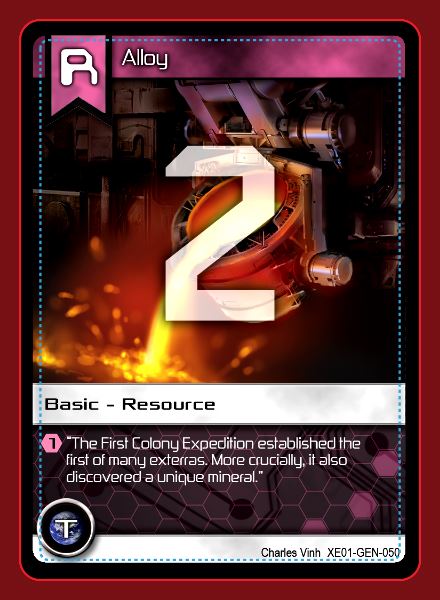
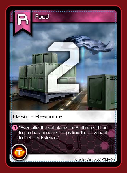
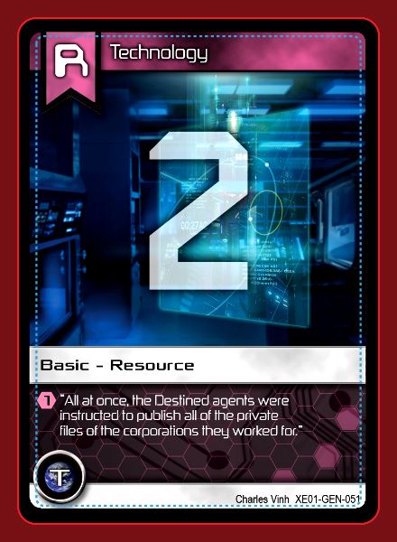
1> Is the number on the card readable (without having to squint)?
2> Is the artwork below "reasonably" visible?

I just want YOUR impressions.

Please give impressions for all three (3) cards - as your opinion may vary depending on which card you are commenting about.

I have my own opinion - but I just wanted to know YOURS...

Thank you.

Squinshee
Squinshee's picture
Offline
Joined: 10/17/2012
After having read your rules,

After having read your rules, I think it's great that these numbers are now on the front of the cards. Simplifies the design greatly.

These numbers are incredibly visible, but I think to a detriment to the art. They could easily be 1/4th of the size as well as not blocking any of the art. What about in the top-right corner? Many card games have numbers on them and have survived and thrived with smaller numbers. You shouldn't worry so much about their visibility.

questccg
questccg's picture
Offline
Joined: 04/16/2011
Umm...

Actually these are the "Backs" of cards, not the front.

The front ones have smaller symbols as you have indicated in both the Top-Right hand corner and the Bottom-Left hand corner.

These "Backs" are to be used when "playing" cards for "Buying" or "Banking" cards. They are BIG in the hopes that the numbers are visible from across the table...

(I'll wait for more replies - before I post my own comments...)

Note: If we had only face cards, we would be unable to tell the storylines behind the Megacorporations and their struggles for dominance over the Terran civilization (including the Exterras - space colonies)...

Note #2: For those who do not know - my Upgrade Cards are DUAL-SIDED. These samples are for "Card Backs" which vary per card. This also sets up the possibility for the "Planetary Expansion" where "Resource Cards" will earn BONUS Trade Values (like +1, +2, +3, and x2) making banking of certain cards of GREATER value.

This also will introduce the notion of "Tradeships" which are the Merchant Fleet used by the Exterras.

This is what "Tactic" cards look like (Face):

Note #3: I originally wanted "Tradeships", "Missions" and "Planets" to be a part of the original game. But newbies to the game found that there were "too many choices" available to them... So I cut those aspects out of the game and want to introduce them in an "Expansion" which will change how the game is played - kind of like establishing a set of rules - and then an expansion "breaks" those rules and defines new ones...

I Will Never Gr...
I Will Never Grow Up Gaming's picture
Offline
Joined: 04/23/2015
Looks good

All 3 cards look good to me. I would consider decreasing the transparency even more on them to make them bolder, especially if it's the card backs and the artwork is elsewhere.

This is most apparent on the second one. The lighter blue background makes the number a little more washed out than the darker ones do.

One other note would be to watch those safe/cut lines. Your iconography and wording is dangerously close or overlapping the cut lines.

I Will Never Gr...
I Will Never Grow Up Gaming's picture
Offline
Joined: 04/23/2015
Actually, with the number

Actually, with the number being more important than the art, and the artwork being reasonably visible even with the numbers over top, I would consider maybe even not having any transparency on them. Make them as bold and visible as possible.

Squinshee
Squinshee's picture
Offline
Joined: 10/17/2012
I see no reason for the backs

I see no reason for the backs of the cards display new information. It adds unnecessary complications to the design without any benefit.

questccg
questccg's picture
Offline
Joined: 04/16/2011
Planetary Expansion

Squinshee wrote:
I see no reason for the backs of the cards display new information. It adds unnecessary complications to the design without any benefit.

Well for one it establishes nine (9) different resources for the game. These resources will be "built upon" allowing bonuses during Trade Missions. This will make "Banking" more complex - yet at the same time make the entire process FASTER. Each planet you embark upon requires a "Mission" and there will be five (5) missions and a certain amount of different planets. How many is TBD... Each "Planet" will have bonuses for certain types of "resources" (like +1 Medicine or +2 Alloy or +3 Minerals or 2x Contraband). These are just examples.

This will speed up the "Banking" of resources for quickSilver (qS). And make the Tradewars scenario quicker to win. It also makes the game even more strategic for players who prefer to be "non-aggressive" in their way of playing the game.

let-off studios
let-off studios's picture
Offline
Joined: 02/07/2011
My Responses

1. Yes, the numbers are readable. I second the suggestion above about removing all transparency.

2. Yes, the artwork is reasonably visible. If I see the entire piece of artwork on the other side of the card, I would have no problem with this.

Have you given thought to changing the color of the border of resource cards to indicate their specific resource? This might also help a player across the table know what it indicates, at a glance.

My assumption is that you have different classes of cards (like your Resource and Tech examples in this thread), so changing border colors is not feasible. Otherwise you likely would have done so already. Just wondering.

Squinshee
Squinshee's picture
Offline
Joined: 10/17/2012
@ questccg All of that is

@ questccg

All of that is great and can also be achieved with the resource values printed on the front. Again, printing that information on the backs of your cards isn't adding anything - it probably makes it more confusing. This makes the simple act of drawing cards in your game weird.

Syndicate content


forum | by Dr. Radut