Home » Halfling Heist Font Comparison 1.1
User login
Apr 16 2024
| Chat GPT: Testing as a design assistant (8) by larienna |
Apr 15 2024
| Winner Announced for the Meta Progression Community Challenge! (0) by The Game Crafter |
Apr 14 2024
| Wizardry Legacy: the Forgotten Academy (11) by larienna |
Apr 13 2024
| Hi guys ~ Gameland and Yaofish are officially accepting board game design submissions! (1) by questccg |
Apr 12 2024
| TradeWorlds — Tactical Core (1) by questccg | |
| A programmer's dilemma (16) by larienna |
Apr 9 2024
| Qubits: a solo trick taking game (9) by Wobt2 |
Apr 6 2024
| Worker placement, Role selection and Action cards: Is it the same thing? (11) by larienna |
Apr 4 2024
| Site Ads and Google Experiments (0) by questccg |
Apr 1 2024
| TradeWorlds — Smuggler's Run (7) by questccg | |
| Single Item Shipping at The Game Crafter (0) by The Game Crafter |
Mar 28 2024
| Protospiel Indy 2024 (May 24-26) (0) by The Game Crafter |
Mar 21 2024
| How to avoid being blocked at content creation (10) by questccg |
Mar 20 2024
| Protospiel Indy 2024 (0) by sirvalence |
Mar 19 2024
| In need of some IDEAS concerning a "Battle" System (15) by questccg |
Mar 13 2024
| How to avoid quarterbacking in an adventure game (7) by larienna | |
| How complicated could math get? (23) by X3M |
Mar 8 2024
| Can we have gaming ads on this website (7) by questccg |
Mar 5 2024
| Dice Mitigation Challenge - Winner Announced! (0) by The Game Crafter |
Mar 4 2024
| Delving! - " That is when it hit me, it was starting to feel like other games" (3) by MarkJindra | |
| Game Purchase Contract (0) by MarkJindra |
Feb 28 2024
| Blackboard Boogie Board: a bit of a REVIEW... (2) by questccg | |
| Toy play: Creating a log while playing (15) by questccg |
Feb 24 2024
| New Contest at The Game Crafter - "That Cool Stock Part Challenge" (0) by The Game Crafter |
Feb 19 2024
| Will....this die roll work? (11) by X3M |


Comments
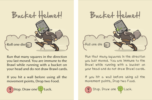
Brilliant Card. Made me
Brilliant Card.
Made me chuckle - which is a GOOD sign for a humourus game XD
Totally go for the font on the left (the image and the actual text does a great job of making it funny, if you have your card look like it was handwritten by a young person can be taken to mean that you don't want people to take the card seriously. Wheras I NEED (and want!) to take the game - underneath the funny - as a good game.
tl;dr Dont make the WHOLE card funny. Make it partly so.
To quote Kirk Lazarus from Tropic Thunder:
---"Everybody knows you never go full retard. "
Ahaha, excellent quote. (That
Ahaha, excellent quote. (That is a great movie, too.)
Thanks for your feedback Cogentesque, here and on the forum thread! It's been incredibly useful. =)
I personally agree with your emphasis on allowing the data of the game to speak for itself. I'll be taking all of the feedback received to my graphic designer and we'll hash it out some more, but this time with much more knowledge!