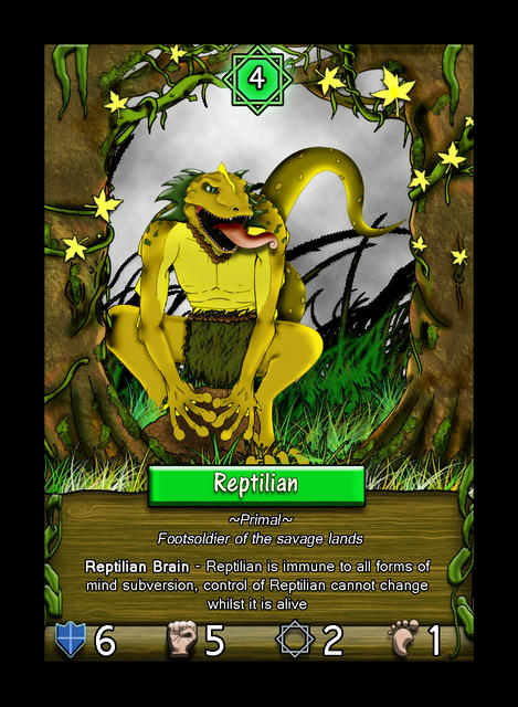
Just wanting some feedback on the overall look and feel of the creature card. This is from an in-development game we first based on the old Julian Gollop Spectrum game "Chaos", you can have a look at it here -
www.thecreationofchaos.blogspot.co.uk
If you like.


Comments
The problem with the text is
The problem with the text is two-fold.
One, you need to use a font that is easier on the eye to read. Most fonts are not well suited for use in small text size situations.
Two, the outline or outer edge of the text is a different color from the letters (and numbers at the bottom). This thin edge of black color visually eats away at the white color area of the text. It all goes back to visual contrast. The wood grain does not provide sufficient contrast for the white text, alone, so the black edging/outline provides some degree of sharper contrast to the white of the text. The way that you have done it presents a problem, though. You have traded one problem for another.
I use Photofiltre a lot, and in that program, what you are doing is a text effect called Stroke. I don't use Photoshop or GIMP, so I am not sure what it is called in those programs. I used to have a an image editing program from Ulead which had an option/effect that would fix the problem your text suffers from. That was years ago, though, and I no longer recall what that effect was called. Basically, it would make a wider area of black around the text, and it eliminated the outline effect (Stroke) that you are using on your text, here.
To fix the problem of the font, itself, you need to change the font that you are using for your small text.
Simple and Clean
The layout is simple and clean. Symbols and text are easy to read and the color and texture fits the theme of creature very well.
Thanks.
Thanks.
The painting is OK, but I
The painting is OK, but I feel somewhat uneasy about the card description. Maybe the font too ordinary, or the text/title background not too fitting to the rest of the image.
Just my feeling.
Thanks for the input, I think
Thanks for the input, I think i know what you mean the Font is a bit jarring perhaps.
Will try some different fonts out before the finished version.