Skip to Content
 

Card Workshop #7 A Different Take....

4 replies [Last post]
Tbone
Tbone's picture
Offline
Joined: 02/18/2013
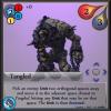
Tangled New
Tangled Old/Current

(Current:bottom New:top)

I have been dabbling into some different designs for my cards for Battle of the Monumentals... The design before was too small; definitely not enough room. I have decided to adopt a similar approach as the designers did for Summoner Wars: Side ways cards.

I'm not sure if this is a popular layout or if its dumb to take after Summoner Wars. This layout allows me to do a lot more with the cards and it does not make the board any less finicky since its only expanding horizontally.

What do y'all think? This is of course in the EARLY design stages for the change to the cards.

X3M
X3M's picture
Offline
Joined: 10/28/2013
Sideways is good too

If it is an improvement to the game and a big help. Just make them sideways. I know that holding cards might be weird at first, but it is a nice change and not a problem.

As suggestion for better looks: the upper right box; remove the movement arrows and try to center the diamonds, armor/sword/pebble¿, and the tekst.
Place the movement arrows in the down left box? That is if you have not planned to place other stuff there besides of the flying symbol.

let-off studios
let-off studios's picture
Offline
Joined: 02/07/2011
Fanning a Hand

My only concern with orienting cards horizontally is how many a player needs to hold and consider at any one time. How large is a hand of cards? How do you think that will impact what they need to see at a glance? Is there a way to condense some if the most pertinent "sorting" symbols in an upper corner or along one side?

Think about how most card games use cards with symbols tucked into an upper corner for easy organization. Beyond the usual clubs, diamonds, hearts, and spades, there would be coins/cost, attack/defense, etc. to consider. Depending on the organization of phases of your game, I'd suggest putting cost info in an upper corner. Meanwhile other vital information for a card could be spread across the rest of it, since it would be more frequently considered after the card is already in play.

Tbone
Tbone's picture
Offline
Joined: 02/18/2013
Initial Post

I changed the initial post to give a side by side comparison.

The cost icons definitely need to move closer to the edge. The movement icon though, needs to be in the stats and info area where it is now. Moving it to the attribute area would be unnatural. Why do you think moving it there would be better?

Lef-off the hand size is at a minimum of 5, another reason I didn't see it as a problem to do this. What do you mean by "sorting" symbols?

wombat929
wombat929's picture
Offline
Joined: 04/17/2015
More info, less theme

I think the second version works better as an "info" card for a creature, but it mutes the theme somewhat. The art in this kind of game is extremely important, as it adds to the emotional tale you're building in your head as you play. Are there standees or other representations of the monsters in play, or just cards?

As for the cards themselves, boy that's a lot of info!

Syndicate content


forum | by Dr. Radut