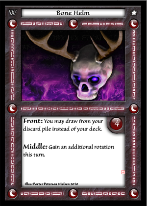
Here is the third and most recent example card for my game duel.

| Hidden Movement: What Makes it Cool? (19) by larienna | |
| Dymino Monsters Update 4-18-2024 (0) by Stormyknight1976 |
| Wizardry Legacy: the Forgotten Academy (12) by larienna |
| TradeWorlds — Tactical Core (3) by questccg | |
| Introducing, Jacob! (that's me by the way...) (0) by Jacob | |
| Chat GPT: Testing as a design assistant (8) by larienna |
| Winner Announced for the Meta Progression Community Challenge! (0) by The Game Crafter |
| Hi guys ~ Gameland and Yaofish are officially accepting board game design submissions! (1) by questccg |
| A programmer's dilemma (16) by larienna |
| Qubits: a solo trick taking game (9) by Wobt2 |
| Worker placement, Role selection and Action cards: Is it the same thing? (11) by larienna |
| Site Ads and Google Experiments (0) by questccg |
| TradeWorlds — Smuggler's Run (7) by questccg | |
| Single Item Shipping at The Game Crafter (0) by The Game Crafter |
| Protospiel Indy 2024 (May 24-26) (0) by The Game Crafter |
| How to avoid being blocked at content creation (10) by questccg |
| Protospiel Indy 2024 (0) by sirvalence |
| In need of some IDEAS concerning a "Battle" System (15) by questccg |
| How to avoid quarterbacking in an adventure game (7) by larienna | |
| How complicated could math get? (23) by X3M |
| Can we have gaming ads on this website (7) by questccg |
| Dice Mitigation Challenge - Winner Announced! (0) by The Game Crafter |
| Delving! - " That is when it hit me, it was starting to feel like other games" (3) by MarkJindra | |
| Game Purchase Contract (0) by MarkJindra |
| Blackboard Boogie Board: a bit of a REVIEW... (2) by questccg |
Comments
So far, so good
Though I'm wondering if the card's name is actually readable when printed. Have you tried a little larger font size? Another thing is the number contrast, with all the shades and light effects. Could it be bolder so as to see it right? I'm thinking perhaps 6s and 8s could get mixed. Am I too blind?
Keep thinking!
The title will actually be
The title will actually be all capitlas as in my other two cards. I caught the mistake after I posted.
I will work on the readability of the numbers as well for contrast purporses.