
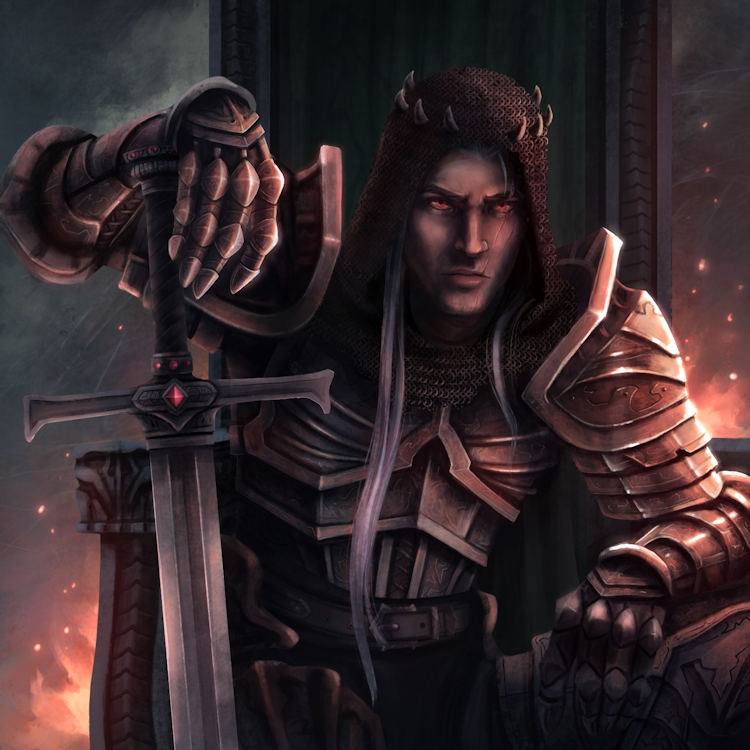
Here is a sneak peek into one of the two (2) Lord tiles available in the First Edition of the game:
If you click on the image, you will be brought to a new tab with a higher resolution/size of the artwork.
Lord Dunken is the Forsaken Knight of the Human Race of Order... He commands a lot of respect and is a feared Immortal...
As usual, if you have any comments/feedback/concerns/questions please feel free to respond and add your comment below.
Cheers!


Comments
Feedback
The artwork looks fantastic, of course.
I wonder at your choice of the name. Or rather, the spelling. It makes me think almost immediately of a certain corporate coffee and donut chain...
Maybe that's just me.
Hmm... I understand what you mean
I could have named him "Lord Duncan" but if you compare with "Lord Dunken", I think the 2nd version seems more progressive. The first version if you search a bit more on it, you get the information that it is a Gaelic name with roots in Scotland (Scottish origin).
Doing some searches about the 2nd version leads to "Dunken" meaning "to think" and "to consider". Or "to deem" and "to judge"... I think that is very appropriate! Since it is more "nuanced" than simply being Scottish.
Note that the version of "Dunken" can also be considered a form of writing of the name "Duncan" (It is a variant of the name also...) I did some more digging and "Dunken" is also a real-world version of the Scottish family name also... But since it has other meanings, I prefer this version to the more known one ("Duncan").
So I think because this is not a real-world game, it is in a Fictitious Fantasy World, the 2nd version is more appropriate! Even if it too can be traced back to Scottish origins also.
Again just based on some digging that I had done...
I agree that looks very good.
I agree that looks very good. One small critic is that the dark chain mail against the dark column maybe a little hard to distinguish on tiny cards in low lighting.
Yeah I know...
It's actually not a dark column but a throne... And Lord Dunken is sitting on his throne. It's also true, that all of these 5" x 5" @300 DPI illustrations look so freaking amazing in their original format, that down-sizing to the Game Tile format means less details (just by sheer change in the resolution and size of the image).
But then again, when you look at full-sized art like in Magic: the Gathering, you see how they "cut" the cards to fit into the square box at the very top of each card (aside from the name and mana costs) and then when you see one with "transparency" and the ENTIRE card... You are like: "Wow. What a difference seeing the entire card...!" I've seen a Chandra (Red/Flame Steampunk) in the two (2) versions and the "transparency" version is totally awesome.
My Game Tiles will be 2.5" x 2.5" @300 DPI ... So about 50%. And you will of course see much of the detail ... But in a smaller format. I was at some point thinking of using 3.5" x 3.5" cards which could put the tiles and allow for the art to shine through... But then there was a packaging issue... Namely that there are no 3.5" wide boxes for that format of Game Tiles. So I stuck with the 2.5" version which is smaller but compatible with all "Poker Card" content.
The good thing is that the art is designed FOR THE FORMAT! So there is no missing art when you look at the Game Tile itself.
I also wanted SQUARE Game Tiles because they present much better in a 4-Player Multi-Player game ... Even in a 2-Player duel, it is much nicer that the cards don't need to be squeezed together and that they FIT in the play area.
But yeah, I understand... It's art and very subjective too. Some might want more contrast (and I do have cards with more lighting) and some are in the middle and then there are some "darker" Game Tiles... Like Lord Dunken.