
double post, sorry, see the following :)
Would appreciate some quick feedback
Tue, 07/11/2006 - 11:14
#31
Would appreciate some quick feedback
Tue, 07/11/2006 - 11:15
#32
Would appreciate some quick feedback
The final changes to the previous cards looks great! And i love the keyboard look: it feels "interactive".
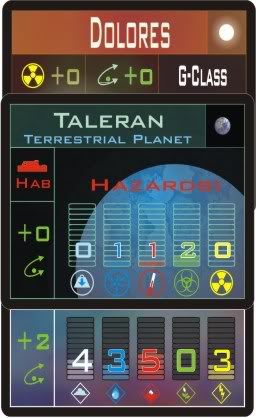
For your Solr, habitation and system cards, they too look very good. I agree with Nestalawe for the points he brougth.
But i'm wondering, if the color schemes are not related, will it not confuse players? There is already quite a bit of information to go through, if a player has to double or even triple check to make sure he did not do a mistake interpreting his cards, it will become heavy and will slow the pace of the game.
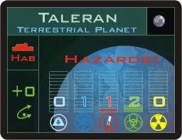
On the Hazards card, place the "green curved arrow with a dot" to the right, like the other 2 cards. Unless you leave the space for other information to be displayed there.
I love the way you display the level and numbers for hazards and resources, it's a great visual aid.
The icons look really nice and are quite clear: gravity, lowest temperature, highest temperature, biological hazards, radiation...no?
Tue, 07/11/2006 - 13:43
#34

Would appreciate some quick feedback
Late to the party here, but since you asked:
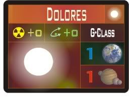
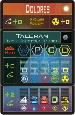
I found the red filter on the G-Class card made the card hard to read.
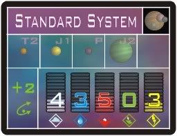
On the terrestrial and standard system cards, I'd make the green orbit column on the right a constant width, so there's a standard set of frames that information falls into on both cards. Onthe standard system card, the main window would be broken down into 6 squares, and on the terrestial card is would be a single window, but the frame would be the same width and height.
Is G-Class Primary and M-Class Secondary relevant information or just a name? If a name, I'd use something more memorable like "Inferno" or "The Two Sisters." That way, players can remember good or notorious cards. The same could be done for planets.
Tue, 07/18/2006 - 16:50
#35

Would appreciate some quick feedback
Once again. I created these last week, but wanted feedback before I design the full run.
These cards represent the larger currents of society, and the occasional individuals that can make tremendous historical impact. Each card also has sections that control the evolution of society (the lower right), and conflicts where only one player's forces are involved (lower left). I'd like to explain every detail, because you all are giving me such good feedback, but that would mean you learning the entire rules set...
I guess I'll have to do my best before playtesting.
Anyhow...
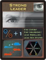
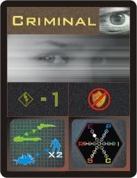
Note: The thin lines around the different sections are all the same width. The apparent difference in these JPEGs occurs during anti-aliasing and shrinking.[/i]
Wed, 07/19/2006 - 11:05
#36

Would appreciate some quick feedback
Hey Hedge,
These are looking good too, though feel a bit 'messier' than your other cards.
I would make the eye images a bit narrower vertically, as the main focus is the eyes, whic his cool. This will also give you a big more room for the information below, especially the text on the Strong Leader card. Does this text want to be centered?
Will it be easy to remember what each type of ship is just from the images? They are all a bit similar, but I don't have a listing of different ship types to work off, so this may be ok.
The social grid looks good, though the colours may want to be a bit brighter to bring them out a bit.
Otherwise they are looking good... Kinda need to be able to look at all the different cards side by side before making any more commetns right now - need to be able to see how they fit in with one another and how easy it is to distinguish them from one another.
How many more different types of cards have you got? Are you able to give us a list grouped into types that will be used together i.e. in a player's hand?
Good stuff!
Nestalawe'
Wed, 07/19/2006 - 17:30
#37
Would appreciate some quick feedback
Hey, Nest!
These cards have a "newsreel" sort of theme (the scanlines and "static noise" background, which is sort of hard to make out, in these images), with warmer, human-toned color schemes. I'm trying to avoid using text, thus the images, but I may just go for text and be done with it. In any case, I'll need to work on theicons a bit to see if I can get them to be more uniform.
Overall, there are five decks, each with 100 cards. The Combat deck is only used for system invasion and military actions. The Exploration decks (Stellar, Habitation, and System decks), which are used to create new star systems, and the Hidden Actor deck, which controls social influences.
At no time will a player have a hand of mixed types. In fact, only the combat cards are ever used in a hand at all. The system cards just sit there in groups (and provide places for fleets, civilians, and habitats), and the Hidden Actor cards are drawn one at a time, usually. So the cards need to look distinctive, but not so much because they'll ever be fanned out in a single hand. the consistancy issues are mostly asthetic, but drastically impact the amount of information they give.
I've redesigned the Exploration cards, for example, to be landscape, and nest more closely, saving table space. I'll put up images of those soon.
I hope to start doing final work on all the cards together, so that I can unify the imagery a bit more. Your imput (speaking to eveyone that's posted) has been very helpful, and the process of designing these cards has impacted the rules themselves.
Wed, 07/19/2006 - 17:38
#38

Would appreciate some quick feedback
That's looking really nice, Hedge. If you publish it, I'll buy it just on its looks, regardless of the game. :)
Thu, 07/20/2006 - 05:42
#39
Would appreciate some quick feedback
I like the look of these apart from the eye icon in the top right. While I like the main image in the centre of the card I feel that the top right icon looks odd alongside the main image. The main image has a pair of eyes (which is really good BTW), then you have a third single eye which lessens the impact of, and detracts from, this main image. What other icons could you use for these cards?
Also, the colour of the top text bar (that kind of brown colour) is also not one which I would pick, but perhaps this is a personal preference. I guess it depends on the overall colour code scheme for all the different decks.
You mentioned some rules hedge - are these written down yet or still in your head? When will we get to see them?
Cheers,
Dan
Thu, 07/20/2006 - 12:13
#40
Would appreciate some quick feedback
TheReluctantGeneral wrote:
You mentioned some rules hedge - are these written down yet or still in your head? When will we get to see them?
As you've probably guessed, I'm not a "rules in my head" kind of guy. I write everything down as soon as possible! I'm currently (as my design journal talks about) writing the full draft of the rules so I can start to solo the mechanics a bit. I'll send the rules out to a few others who might be interested (nudge), when they're ready for the light of day.
I'll resume work on the Hidden Actors deck tonight, and probably start a comparative viewing of all of the cards this weekend, to get them all looking good together (harmonious color choices, uniform icon designs, etc.), and I'll be pouring over the feedback here, to make sure concerns aren't overlooked.
In the meantime, here are the new Exploration cards, in spiffy Landscape format and a layout that is made for nesting together:
And here are two shots of them nested, with the planets in view, and hidden:
Thoughts on the new look?
Tue, 07/25/2006 - 00:07
#41
Would appreciate some quick feedback
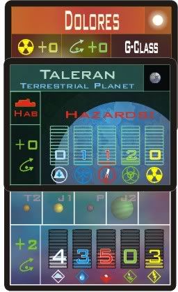
More revisions to the system cards, most notably to the habitation card (with the planet). The Stellar card (on top, with the sun) has bee adjusted so the lower two cards don't overlap, and the top card sits right in the center, with the most-needed important information showing on all parts of the cards.
Here's the newest look, though interest seems to have waned:
 [/img]
Tue, 07/25/2006 - 00:35
#42
Would appreciate some quick feedback
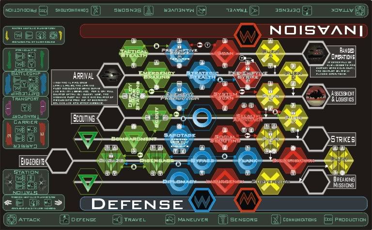
Here's an overview of the combat-board. This is the side-board that players will wage full-scale wars on in a single turn. Note the color-coded symbols from the combat cards, as well as the unit silhouettes along the sides. The "M" and "W" hexagons should look familiar from the Habitat card. The pictures from the combat cards of the fleet arriving might make more sense as well. I wrote down a lot of imagery ideas for shared images such as the "Phase of War" pictures, and it's only now starting to pay off. Still have four more of those to do, yet...
It's all coming together, but man, what a ton of work to get it all to look not only pretty good, but consistant! Every change in icons means a lot of double-checking, since everything's so tightly integrated. That's why I need your help to get this right as possible, to minimize work after playtest begins!
With a project of this complexity, however, I've found that having pretty strong visuals really helps the game be played, since there's a ton of information being passed around. Ballpoint pen prototypes won't cut it, here, else I'd go that route, believe me!
Still hoping for some new feedback!
Tue, 07/25/2006 - 05:40
#43
Would appreciate some quick feedback
This is looking incredibly cool Hedge!
Hard to comment too much on the details - but feel free to email me the full size image so I can check it out properly.
Really like the hex-style layout. There is a helluva lotta information in here, but even so, the layout, design and colours 'feels' like the gameplay will be intuitive.
I am gonna love playtesting this ;)
p.s. What program are you using to design with?
Tue, 07/25/2006 - 07:05
#44
Would appreciate some quick feedback
Hedge-o-Matic wrote:
Thoughts on the new look?
Well, I'm disappointed that there are still no starfields on the planet and system cards. Did you experiment with that yet? However the new landscape format works much better IMO.
Tue, 07/25/2006 - 07:11
#45
Would appreciate some quick feedback
Nestalawe wrote:
This is looking incredibly cool Hedge!
Hard to comment too much on the details - but feel free to email me the full size image so I can check it out properly.
If you're sending full size images out to Nestalawe, I'd like to see it too if that's OK. Nest has my email address so get him to forward it on.
Quote:
Really like the hex-style layout. There is a helluva lotta information in here, but even so, the layout, design and colours 'feels' like the gameplay will be intuitive.
I agree, and I see now how this is going to work. The image in conjunction with the original journal explaination really helps to pull the ideas together. How long do you expect a battle on this sideboard to take to play out? Is downtime going to be an issue?
I really like the way this is going - the combat system here feels quite innovative! Still looking forwards to seeing the rules!
Tue, 07/25/2006 - 10:44
#46
Would appreciate some quick feedback
To me, everything looks very well done Hedge. Nice job!
Good luck!
Justin
Tue, 07/25/2006 - 11:44
#47
Would appreciate some quick feedback
Maybe just post a link to the full-size image of the combat board on ImageShack or something, because I'd like to see it too. It's very striking. I have no idea what's going on there, but it's the sort of thing that would stop passersby at a con.
Tue, 07/25/2006 - 12:07
#48
Would appreciate some quick feedback
Does anyone know how to post URLs so that there's a text hyperlink, rather than the full URL printed into the post?
Tue, 07/25/2006 - 12:41
#49
Would appreciate some quick feedback
Hedge-o-Matic wrote:
Does anyone know how to post URLs so that there's a text hyperlink, rather than the full URL printed into the post?
Yep! Use (url=http://www.bgdf.com)The Board Game Designers Forum(/url) but replace the () with [].
I.E.
The Board Game Designers Forum
-Darke
Tue, 07/25/2006 - 12:46
#50
Would appreciate some quick feedback
Mouse over the URL button when composing a message and it tells you.
If the problem is that the URL is too long, you could also use TinyUrl.com.
Edit: Slowpoke!


Thanks all! Your feedback has been great, and I'll be implementing your changes.
Soulbeach: Thanks! Tha hazards are actually: Gravity, Pressure, Temerature, Biological, and Radiation.