Skip to Content
 

Artwork vs Flavor/Story text

22 replies [Last post]
larienna
larienna's picture
Offline
Joined: 07/28/2008

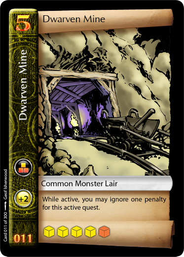
If you had space on a card only for ONE of those things:

- Artwork representing the situation, item, etc.
- Flavor text or story text representing item, situation, etc.

Which one would you chose?

They say a picture is worth a thousand words, so from this point of view, a piece of artwork is going to put down more words that you can possibly fit on a card.

For me, I rarely read flavor text. I might be more likely to read it in a solo game, but when playing with others, I rarely have reflex to do so. Also when somebody read me text like in Dead of winter, I kind of not understand what is going on. I need to read it by myself if I really want to understand.

As for artwork, it might not be clear what the designer want to represents with a single picture. But the player's imagination could add up and enrich what is beign represented. You can also get the idea in a glance, without taking time to read. It also makes card easier to identify and spot.

Text might looks easier to write and doing art, but chosing the right words to do the right impression might take as much time as drawing a piece of art.

Jay103
Jay103's picture
Offline
Joined: 01/23/2018
Art. The flavor text might

Art.

The flavor text might get read the first time. Might. And the art might also be effectively ignored. However, the art gets internalized very quickly by the player, and it's used to identify the card in the player's mind.

The text is cheaper, though :) I could write my own flavor text.

let-off studios
let-off studios's picture
Offline
Joined: 02/07/2011
Art

Yes, if given the choice I would choose artwork over flavor text every time. It's more expensive for a lot of reasons.

larienna
larienna's picture
Offline
Joined: 07/28/2008
On BGG, somebody suggested

On BGG, somebody suggested putting the flavor text else where. I have seen this at the end of rulebooks for examples.

larienna
larienna's picture
Offline
Joined: 07/28/2008
Examples of artless events
Jay103
Jay103's picture
Offline
Joined: 01/23/2018
That has no flavor text

That has no flavor text either.

I can certainly see that you might want cards that have no art at all. Some games aren't conducive to having their card concepts represented that way.

(the "superhero" game I'm working up probably won't have art on most of the cards..)

questccg
questccg's picture
Offline
Joined: 04/16/2011
Background images

larienna wrote:
Examples of artless events from Hacker...

Those cards look "very" VANILLA! No art and no flavor-text either...

TBH one simple fix is to choose "Background Artwork" that reflects the nature of each Event. This can be custom artwork with a white layer of 50% transparency to ensure that the art "remains in the background" and allows easy READING of the "Event" itself.

Another option is to use ONE (1) piece of artwork for ALL the "Event" cards. This is less expensive and more affordable. There should be no excuses to produce one piece of art for a "background image"...

But yeah, there is always a way to IMPROVE "Vanilla" cards!

larienna
larienna's picture
Offline
Joined: 07/28/2008
Quote:Those cards look "very"

Quote:
Those cards look "very" VANILLA! No art and no flavor-text either..

There is sometimes flavor text in the bold portion of the cards. But it's not consistent.

Quote:
This is less expensive and more affordable

Well ... I was thinking in doing my own artwork. I practiced a lot lately, and having a project to work on sometimes gives a reason to draw/paint which I currently don't have.

I have not evaluated the amount of time required per art vs nb of art required. I'll judge that after I would have made a few of them.

I am not really sure the technique I will use. I was thinking hand drawing the shape on paper. Scanning digitally. Trace it with inkscape or Art Rage, then paint it with Art Rage(mobile). Not sure if the outline will be part of the art.

Thinking of making something simple without backgrounds in the artwork for most of the cards. I started to learn drawing anime cartoons so it might have a cartoonish look.

questccg
questccg's picture
Offline
Joined: 04/16/2011
Comic-Book-esque 4 step process

larienna wrote:
Well ... I was thinking in doing my own artwork. I practiced a lot lately, and having a project to work on sometimes gives a reason to draw/paint which I currently don't have...

Just remember that if that doesn't work out... There are a TON on online resources for artwork... And you can PAY for a piece of art that you could use for a "Background" for some of your cards. Like in the example, the Event cards could have benefited from some kind of imagery as the base layer for those cards.

And for a BETTER art process, I learned this when working with Geof Isherwood... If you are "okay" with Comic-Book-esque kind of drawings, the following 4 step process is the best way to go:

  1. Use a pencil to "sketch" the approximation of what you want to draw.

  2. Use a black pen to "ink" the illustration. Use thicker lines and darkened areas to make the artwork "pop"!

  3. Scan the "inked" illustration. This will give you a high contrast with the original art and the inked layer. Much easier to work with.

  4. (The hard part) Use Photoshop to "digitally" COLOR the illustration. As Geof would put it, use the Black inked lines and area as a MASK and color BEHIND the Black ink...

And that's what the process looks like with "Quest Adventure Cards(tm)". This is a TEST card for the "2nd Edition":

I personally LIKE this style of card (lot of inking). When we (Geof and I) talked about what kind of illustrations/art I wanted, I told him to play with the ink and make the illustration with a lot of "darker" areas.

I think the result in pretty decent?! What do you think?

Cheers!

Note #1: I believe the initial hand drawn images were like 5" x 8" (or something like that). Bigger than the card size, allowing me to "scale" down the images. But of course for your own needs do something similar, make slightly BIGGER images you can "scale" because it's better to have more resolution than less...

larienna
larienna's picture
Offline
Joined: 07/28/2008
Quote: There are a TON on

Quote:
There are a TON on online resources for artwork

Like I said in another thread, it's hard to get cohesion between online resources. The only thing so far that could work is gameicons.net which has a cohesion between each other.

About your card art, It's interesting to see that there is shading in the drawing and in the colors.

Here is some "Megaman" tests I made by painting directly in Art Rage. One tool that I liked was used for the inking and it kinds of "adjust" your strokes to make them smooth. This is why I was thinking in doing the inking in Artrage to benefit from that smoothing. I think I'll need to do further testing:

http://art.lariennalibrary.com/uploads/DigitalPaint/ArtRage-MegaMan/Neo_...

http://art.lariennalibrary.com/uploads/DigitalPaint/ArtRage-MegaMan/Tell...

I Will Never Gr...
I Will Never Grow Up Gaming's picture
Offline
Joined: 04/23/2015
Always Art, but ..

Always art over flavor text (and I LOVE good flavor text) but, I see no reason in the vast majority of cases, why there can't be both.

The examples linked to above have TONS of room for both if the wording was made more concise and iconography was added for many of the actions to be taken.

Good graphic design > Art > Flavor text but all 3 combined = beauty.

Jay103
Jay103's picture
Offline
Joined: 01/23/2018
This is something I put

This is something I put together for my first Kickstarter

https://ksr-ugc.imgix.net/assets/021/014/013/23e39b61a2caa644c5bda0816a3...

Most digital artists create their sketches and inks on a tablet, rather than scanning stuff in, but basically the same process. Sketch, inks (erase the sketch), flats, shading. The graphic I linked to doesn't include the "flats" stage.

Tim Edwards
Offline
Joined: 07/30/2015
Just casting my vote for art.

Just casting my vote for art. No doubt in my mind.

questccg
questccg's picture
Offline
Joined: 04/16/2011
Different art

Jay103 wrote:
Most digital artists create their sketches and inks on a tablet, rather than scanning stuff in, but basically the same process. Sketch, inks (erase the sketch), flats, shading.

Geof isn't a "digital" artist. He from the era of 30 years ago when people were still drawing and inking on cardstock (not paper). This is especially true when Geof inks with actual INK not just a ink pen... I personally really enjoy the "classic" look. Some people critique the work and say that it's very simple... But I like all the black shadows and textures that he puts into the images.

But with my project (the Original Quest), that was the first time that he used "digital" methods for coloring. Before he used to do watercolor. I think "Quest" artwork was pretty decent... Although I did get one big "bash fest" on BGG about how "average" the art looked. Some people thought that the art was "under-par". This is the image in question:

However that's the thing, I enjoy art of this style (Comic-Book-esque). I know it's not Magic: the Gathering quality. But if EVERYTHING looked the SAME all games would be BORING! (That's another angle).

Note #1: I bet if you ask the people who called this an "inferior" drawing should TRY and see if you can make an improved version of such a "neutral" type of illustration. I mean it's a "Garlic Clove"! Doesn't need Wings or Fire Breathing breath... If you know what I mean. Vampires HATE the stuff... Enough for my scenario. And BTW I disagree. I think the illustration is very true to life and the shading pretty decent quality with shadows and all.

But everyone is entitled to their opinion...

larienna
larienna's picture
Offline
Joined: 07/28/2008
I really like those pieces of

I really like those pieces of art too. The graphic design around the card is average, but the art itself is awesome. Cartoonish artwork fits very well in board games.

I am not sure if I should try doing the sketch on paper or digitally. I think I prefer doing it on paper, then scan it and color it digitally. It will be more precise this way. Sketching with a mouse is out of the way, else I could sketch in ArtRage, but there is a small lag that could make the process annoying. Painting should not be so bad.

I am giving a try at sketching digitally. Will post it in the next post.

larienna
larienna's picture
Offline
Joined: 07/28/2008
Here is a sketch I made with

Here is a sketch I made with ArtRage on a cell phone.

http://art.lariennalibrary.com/uploads/DigitalPaint/ArtRage-Random/Quick...

I think I could actually do better with real pen and paper. It seems harder to fix and continue previous strokes which is not a problem on real paper. Even if I use a translucent tip stylus, it's hard to continue a previous stroke. It also seems harder to get the curve right. There is not a lot of lag with the pencil tool compared to other tools.

As anything else, it might just be a matter of practicing more. But for now, I think I'll stick to pen and paper. I intend to get a small sketch pad allowing me to draw in the bus and subway.

questccg
questccg's picture
Offline
Joined: 04/16/2011
One way to get BETTER at drawing Manga

Is TRACING! Yup... You find a Manga drawing and you use thinner paper, put it over the drawing and trace along the lines.

I met another artist at Comic Con this year and she said that's how she became good at drawing Manga... Tracing at first but then you get good at things like "Eyes" and facial elements, etc. And eventually you can DRAW "basic" Manga drawings without any aids.

You could try this method to make Manga characters. It may help also!

BTW we e-mailed back and forth a couple times and she would be interested in doing some "Character" Art (Character and simple background). So I have yet a 4th Artist that I will be dealing with... If all goes well with Monster Keep (MK)...

Cheers!

questccg
questccg's picture
Offline
Joined: 04/16/2011
Exactly correct

larienna wrote:
I really like those pieces of art too. The graphic design around the card is average, but the art itself is awesome. Cartoonish artwork fits very well in board games...

Yes ... to me that art looks great. The Graphic Design (as you said) is "average" and that's 100% me... I had a "style" I was going for and that's what the "layout" was that I wanted. I think this "layout" is sufficient for what I want "Quest v2" to be.

I'm not in the "re-design" department because I found what I needed in terms of revised "layout".

But the fact of the matter is that the art is GOOD! IMHO.

Jay103
Jay103's picture
Offline
Joined: 01/23/2018
I like the garlic.

I like the garlic.

larienna
larienna's picture
Offline
Joined: 07/28/2008
I am practicing drawing

I am practicing drawing with:

Kids draw: The big book of everything manga

https://www.chapters.indigo.ca/en-ca/books/kids-draw-big-book-of/9780823...

I basically made only characters so far, a few robots and creatures. The only issue so far is that besides the hair cut, I have little ways to differentiate faces from one to another.

Jay103
Jay103's picture
Offline
Joined: 01/23/2018
larienna wrote:The only issue

larienna wrote:
The only issue so far is that besides the hair cut, I have little ways to differentiate faces from one to another.

Sounds like you fully understand drawing manga :)

questccg
questccg's picture
Offline
Joined: 04/16/2011
I'm sure that would make Geof happy!

Jay103 wrote:
I like the garlic.

Yeah ... I don't know why people feel the need to "judge". Okay I agree that "Charles" artwork is CRAZY in a "Mad Genius" sort of way... I have no clue how he does it... TBH.

But Charles enjoys teaching and painting actual works of art too. Even though he has an eye for "realism" in his art.

But Geof has some amazing "Dr. Strange", "Conan: the Barbarian" and even some nice "Vampirella" artwork too. If you want something to look like from a 90s Comic Book or just have a more "Comic Book" FEEL to it... Geof is the go-to guy.

I would love to commission more art and work with him... Especially on "Quest Adventure Cards(tm) — 2nd Edition". Geof also has mastery Human Anatomy to be able to have the proper proportions when drawing character (Hands, Arms, Legs, Faces, etc.) Anyway we'll see. For now I need to figure out how to ADD "complexity" to some "simple ideas"...

larienna
larienna's picture
Offline
Joined: 07/28/2008
I have just tried drawing a

I have just tried drawing a med kit yesterday for my game. I drawn 2 copy of them, one in fake perspective, and one in top view.

The perspective version is more beautiful and feels less modern than the top view, but it is also harder to draw especially for curved shapes. Maybe I should avoid perspective for now until my skills improve.

The problem I sometimes get with drawing is the forest syndrome. How to draw a forest without drawing every leaves in the forest. In painting, you could put stain that gives the impression of a forest, but in drawing, it is much more difficult. From what I remember, you only draw the leaves in the foreground.

I think I am going to have multiple try at this one. I think sketching to get the shape on paper is OK. I am not sure about tracing it because I don't think my drawing skills are as good as the artwork from Geof shown in this thread. I am thinking in painting digitally directly under the sketch and them maybe trace a few important line to sharpen the image a bit like in my mega man "Neo Metall" linked previously.

I will be making some test, I might try different approach just to explore the results and find a method that fits to my limited skills. I'll post it when ready.

Syndicate content


forum | by Dr. Radut