Skip to Content
 

Box Art Ideas - Monaco: 1929

17 replies [Last post]
Maritoe
Maritoe's picture
Offline
Joined: 01/25/2015
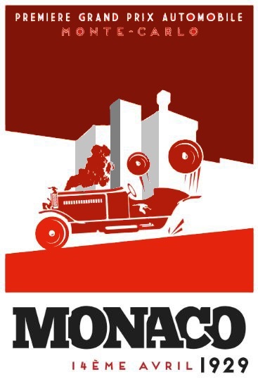
Monaco: 1929 (Box art version 1)

I'm into graphic design and I often like to design artwork for a game really early on in the process of game making, I know this isn't convention and some people will be a bit like what? but it helps me think of ideas and focus in on a feeling for the game.

This is some art I did for my game 'Monaco: 1929', you can read about it if you want by following a link to my page I'm sure. The idea is essentially about racing and sabotage!

I looked at lots of old Monaco posters for inspiration and I hope I got close. But some feedback on the design and anything you hate would be appreciated greatly. Sorry if the image is low res I had to take a screen cap.

Thanks very much,
Maritoe

Dagar
Offline
Joined: 01/23/2015
I like the silhouette fashion

I like the silhouette fashion of your artwork, it resembles the time just fine. The font is cool and fitting as well. However, I have two problems with it:

1) It is not immediately visible for me that this car is sabotaged. That it is a racing care is apparent. Maybe you should rather use some kind of nail trap where the driver (where is he?) is flung out of the car. I needed two looks to see that the thing over the car are the back wheels

2) Too much red for me. Sure, it attracts the views of people browsing a store packed with games or a convention, but in my opinion you should not use the red as the absolute background. Keep the action (The car and what is happening to it) in red, but either darken the background or choose an entirely other color. Maybe black and instead put the name in red? That would maybe be a more focused eye-catcher.

Josh 'Dagar'

Soulfinger
Soulfinger's picture
Offline
Joined: 01/06/2015
I agree on both points. I

I agree on both points. I have been told that red is a very harsh and aggressive color, which is why the pickup truck driving down the middle of the road that pulls into its own lane a moment before impact will inevitably be red. As I understand it, it subconsciously deters female gamers, which is a huge negative for a game like this. We all have the deeply ingrained sense of red meaning caution and danger, which could perhaps translate to "Don't so much as look at this box, much less touch it." If you stick with red, perhaps adjust the shade.

Maritoe
Maritoe's picture
Offline
Joined: 01/25/2015
To Dagar

What did you mean about the nail trap? it sounds interesting. Ye I had some problems with drawing the driver, I couldn't quite get the mix of minimalism and realism right, people are always the hardest. But when I do manage it I'm going for a person flailing their arms about alot, so that should hopefully show how it's out of control a bit better. Hm perhaps the wheels shouldn't be flying off, maybe just falling off of the back?

I'll look into using different colours, I was trying to stick pretty rigidly to the early poster style which often used very bright colours but I may well darken the red up a bit!

Thanks very much for the feedback! Keep it coming:)
Maritoe

Maritoe
Maritoe's picture
Offline
Joined: 01/25/2015
To Soulfinger

I experimented with blue but it didn't quite have the same clarity I'm not sure why, I think it blended with the white too much. But one other colour I did find that worked was a burnt orange sort of thing, it's more mellow and still looks vibrant and stylish so I might switch to that. What do you think? Thanks for your advice! You seem like you know your stuff when it comes to design so I appreciate it:)

Thanks a bunch,
Maritoe

Dagar
Offline
Joined: 01/23/2015
Since you mentioned the

Since you mentioned the wheels falling off: You could maybe let the car spark and the wheels lie or roll behind the car, on the left border of the picture.

I imagined a band of nails on the road and the front tires popping, the driver being hauld over the hood of the car. But the trap might be hard to design so that the information is clear on first glance.

Maritoe
Maritoe's picture
Offline
Joined: 01/25/2015
Version 2

I put a new post up, it's a screen cap of the second iteration. I changed the wheels so they're clearer and also altered the red so it's more of an orange, which I think looks nice. Still no luck with the driver though! Thanks Dagar and Soulfinger for your advice!

Thanks again,
Maritoe

Soulfinger
Soulfinger's picture
Offline
Joined: 01/06/2015
I'm thinking that you are

I'm thinking that you are referencing some of the old Art Deco Monaco posters, which had more of a blood orange coloration. Personally, I dislike them. The same color scheme is used for the old pulp exploitation novels or horror movie posters, like Black Sunday. Your game's theme makes me think more of It's a Mad Mad Mad Mad World -- sabotage but with whimsy, so the harsh coloration feels out of place. Maybe keep the red but up the proportion of white. I'd be curious to see what you have with the red and white inverted with a blue or orange car. Maybe something like:
http://www.zazzle.com.au/vintage_travel_poster_motorcycle_race_print-228...

Then again, I think a layout like this may better enable you to convey the game's theme:
http://1.bp.blogspot.com/_zqFoq3qej2c/SxXTCQqQg5I/AAAAAAABKpk/8BjhhACh8V...

Soulfinger
Soulfinger's picture
Offline
Joined: 01/06/2015
Getting there. Too brown, at

Getting there. Too brown, at least on my screen. Also, maybe could use a band of color along the bottom, which will help if the adjacent edge of the game box is colored.

Dagar
Offline
Joined: 01/23/2015
Wow! I really like the second

Wow! I really like the second one (which you should definitely link here or it might fall into oblivion after some days). Now take this and maybe turn just the car and its parts red, or additionally the 'Monaco' lettering.

No thanks needed ;)

Edit: My girlfriend (who has studied art) says the second one looks better and makes the theme better understandable. She thinks you should try the red as third color (besides ochre and white) or another perspective in which the sabotage aspect is more easily visible.

Maritoe
Maritoe's picture
Offline
Joined: 01/25/2015
To Soulfinger

Yes the Art Deco Monaco posters we're exactly what I was drawing inspiration from, I had them open in a window when designing haha. I'm quite fond of the more minimalist ones, not so much the ones with lots of floral imagery which is often a big deal in Art Deco.

I looked at the 'It's a mad mad mad mad world' poster, I think it works because it's all out red whereas mine is neither here nor there. But yes I'll certainly add some colour along the bottom, to frame it a bit better if nothing else.

I did think of having the car coming towards out of the image and I do think that would give a lot more dynamism but is a bit harder, but most likely worth it so I'll give it a shot.

Maritoe
Maritoe's picture
Offline
Joined: 01/25/2015
To Dagar

Oo that's a good idea, here's a link to Version 2:
http://www.bgdf.com/image/monaco-1929-box-art-version-2

I've swapped the colours of the date so that the 1929 is in 'ochre' as you wonderfully put it, I think this frames the word MONACO a bit better. Ye I'm going to try and do a car from another perspective, one coming out from the image, then the wheels can be dropping off the side and the bonnet could be open or something which could look interesting? Still need to suss this driver though!

questccg
questccg's picture
Offline
Joined: 04/16/2011
A couple ideas

If you want to keep a monochromatic setting, well then I would keep the colors ALL REDs. But start off with the SKY being a DARK RED and then as you move through the layers use a LIGHTER colors of RED...

Same goes with the contrasting white, you would use shades of grey to give it a better "feel".

Just some suggestions...

Update: Here is a "quick" sample of what I am talking about.

The grey is also there for some contrast. Again I don't have the vector images or the source - so the edits are a bit "crude"... But they give you an idea of what I am talking about...

Maritoe
Maritoe's picture
Offline
Joined: 01/25/2015
To questccg

I didn't want too much definition in the white backdrop because I thought it would draw attention away from the car and the text which should be the key, and the premise of the poster was that it should be block colour. But I'll most likely do an alternate test version where I add more shades and detail, so I'll be certain to refer back to your sample :)

Thanks very much
Maritoe

Soulfinger
Soulfinger's picture
Offline
Joined: 01/06/2015
Maritoe wrote:Yes the Art

Maritoe wrote:
Yes the Art Deco Monaco posters we're exactly what I was drawing inspiration from, I had them open in a window when designing haha. I'm quite fond of the more minimalist ones, not so much the ones with lots of floral imagery which is often a big deal in Art Deco.

The floral curlicues are more a feature of Art Nouveau, which I'm a huge fan of -- just not for racing posters. Art Deco had more of a Cubist/Modernism sort of aesthetic with loads of Afghan Hounds thrown in (I guess they were popular at the time).

Maritoe
Maritoe's picture
Offline
Joined: 01/25/2015
Version 3

Ah yes I see now, I must have got them mixed up, I love both the Art Deco and Art Nouveau, but from a poster artist standpoint I think I'm going to have to sway more towards the Art Deco as I think it's more in keeping with the original 1920s / 30s Monaco posters.

I've done some experimenting and come up with Version 3, but I've forgotten how to upload images on their own so that's why there's no link.

I changed the sky and added a little border to the bottom to help frame and show the edges a bit better, I'm not overly sure about the blue but experimenting is good so.

Maritoe

Maritoe
Maritoe's picture
Offline
Joined: 01/25/2015
Version 3 Link

Here's the link for Version 3:
http://www.bgdf.com/image/monaco-1929-box-art-version-3

Again, feedback of any kind is extremely welcome :)
Maritoe

Dagar
Offline
Joined: 01/23/2015
Hmm, I have mixed feelings

Hmm, I have mixed feelings about it. It is good that you took some part of the sky away and framed the title for it. Maybe you should experiment a bit more.

Syndicate content


forum | by Dr. Radut