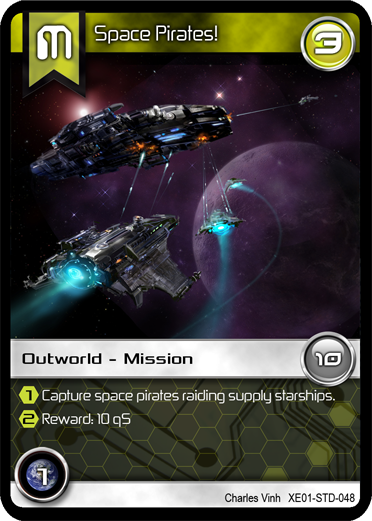
I figured I'd share with the BGDF community one of the latest cards for "Tradewars - Homeworld".
I think this card came out pretty nice. Tell US what YOU think?!

| Dymino Monsters Update 4-18-2024 (0) by Stormyknight1976 |
| Hidden Movement: What Makes it Cool? (18) by questccg | |
| Wizardry Legacy: the Forgotten Academy (12) by larienna |
| TradeWorlds — Tactical Core (3) by questccg | |
| Introducing, Jacob! (that's me by the way...) (0) by Jacob | |
| Chat GPT: Testing as a design assistant (8) by larienna |
| Winner Announced for the Meta Progression Community Challenge! (0) by The Game Crafter |
| Hi guys ~ Gameland and Yaofish are officially accepting board game design submissions! (1) by questccg |
| A programmer's dilemma (16) by larienna |
| Qubits: a solo trick taking game (9) by Wobt2 |
| Worker placement, Role selection and Action cards: Is it the same thing? (11) by larienna |
| Site Ads and Google Experiments (0) by questccg |
| TradeWorlds — Smuggler's Run (7) by questccg | |
| Single Item Shipping at The Game Crafter (0) by The Game Crafter |
| Protospiel Indy 2024 (May 24-26) (0) by The Game Crafter |
| How to avoid being blocked at content creation (10) by questccg |
| Protospiel Indy 2024 (0) by sirvalence |
| In need of some IDEAS concerning a "Battle" System (15) by questccg |
| How to avoid quarterbacking in an adventure game (7) by larienna | |
| How complicated could math get? (23) by X3M |
| Can we have gaming ads on this website (7) by questccg |
| Dice Mitigation Challenge - Winner Announced! (0) by The Game Crafter |
| Delving! - " That is when it hit me, it was starting to feel like other games" (3) by MarkJindra | |
| Game Purchase Contract (0) by MarkJindra |
| Blackboard Boogie Board: a bit of a REVIEW... (2) by questccg |
Comments
Your cards look superb.
Your cards look superb.
When is your game coming out? Or is it already on the market?
Thanks for the thumbs up
The game is in it's 12th revision and was in the hands of one publisher for 11 months. They finally decided to pass on the game - and so I have contacted two (2) other publishers. One has already gotten back to me - and they had some questions regarding the game...
Hopefully they give "Tradewars - Homeworld" a chance to succeed in the market...
Also remember that the game will be OPEN for designing NEW scenarios and adding more ways to play the game. So designers should look for that as a way of supporting a game that wants to support the designer community.
sure is cool looking!
Looks great. Clean, clear. I don't know the context, but one thing...there appears to be a couple different font in use...make sure that they are not confusing. Are those both the number "1" in the two round icons and the yellow hexagons? The art is amazing!
About the fonts
Well I had Ed Wedig (one of the BGDF Graphic Artists) re-vamp the look & feel of the card. He worked on selecting BETTER fonts and helped me in suggesting using hexagons for the bottom text area.
Here's a sample (back in the early days) without the futuristic fonts:
http://www.bgdf.com/node/13083
If you compare the two, I think you'll agree his font selection makes the overall look & feel of the card MUCH better!
Thanks for the positive feedback...! :D
yep...newer look is better
I agree that the newer look is much better...more futuristic. I just don't want to confuse 1 with 7, depending on the fonts. It may not be an issue. Well done either way!