
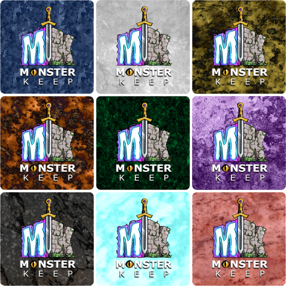
These are the latest "cardbacks" for "Monster Keep" (MK). Blending a ton of textures, colors, overlays, these will be more "memorable" than the previous ones which can also be seen from my Blog.
01 — Royal Blue [Humans]
02 — Slate Grey [High Elves]
03 — Ore Yellow [Dwarves]
04 — Burnt Orange [Gnomes]
05 — Arbor Green [Wood Elves]
06 — Deep Purple [Dark Elves]
07 — Coal Black [Undead]
08 — Frosty Cyan [Giants]
09 — Flesh Red [Orcs]
They all look very different, some with similarities (but that's how the layering of the overlays and colors played out).
Tell me which one is your "Favorite"!


Comments
What is REALLY funny...
I found all the Textures at the "Home Depot" DIY Online store! Crazy but true...!!! The images were just high enough quality (1000 x 1000 at 72dpi). I re-sampled them to 300dpi and then shrunk them to 825 x 825 (which is the size of my cards WITH Bleed) and there was no noticeable loss in overall quality. In fact the images seemed "crisper" when re-sized to the lower dimensions.
Imagine that: "Home Depot" (LOL)
DIY on a whole NEW "level"!!! Cheers.
questccg wrote:I found all
Imagine that: "Home Depot" (LOL)
DIY on a whole NEW "level"!!! Cheers.
That is a fine crafting idea, they look great! I actually use a lot of my wives texture card stock paper for game design, it is better to test that plain black and white sketches.
It is hard to pick a favorite, I guess you will not use the wall layouts mentioned in the other post for the backs? I actually like these backs, the other sample with the icons was great, but I understand your point in leaving them out. Will enjoy seeing more Monster Keep.
My order is:
04 — Burnt Orange [Gnomes]
06 — Deep Purple [Dark Elves]
02 — Slate Grey [High Elves]
05 — Arbor Green [Wood Elves]
03 — Ore Yellow [Dwarves]
07 — Coal Black [Undead]
01 — Royal Blue [Humans]
08 — Frosty Cyan [Giants]
09 — Flesh Red [Orcs]
Something like that. The Elves are up-there on the list (with 3 races too).
Don't let that influence you in any way... That's just my own personal order of cardbacks. I will post updates and Q&As when needed. Right now I am very pleased about how they all came out (cardbacks) and the will go WELL with the latest "card template" that was recently re-designed by another BGDF Designer.
For a better view...
Right-Click and select "Open in new Tab" (in Chrome at least)... This will allow you to see the cardbacks against a "dark background". They look even more appealing in this setting than against the white background of the BGDF forum.
That could influence your favorites, since the designs seem to "POP" better to the eye when against that dark background.
Cheers!
Preferences
Personally, I like the purple one. Second would be the light blue one. They both seem to compliment the logo elements.
In any case, I think you should have a contrasting outline/glow surrounding the logo, so it's offset from the background just a little bit. On some of the colours and patterns, the logo blends in a bit too much for my liking.
Really awesome way to come up with textures, by the way. Sometimes inspiration and resources come from the most unlikely places. :)
Does the color of the card
Does the color of the card back have any in game use? Ie: do you need to know what color it is so that you know what faction it is at any given time?
If yes, I would strongly urge you to add in a symbol to denote each faction for the colorblind as that set of cards is otherwise going to be very difficult for those with color vision deficiency to differentiate. Specifically 3/4, 1/6 and 5/7 combinations look the same to the most common form of colorblind.
Beyond that, they all look good, but perhaps a bit too dark in some cases and as Left Off Studios mentioned the logo could certainly benefit from a faint outer glow.
Some explanations
Well at the start I had ONE (1) Cardback and it was using a leather texture with a "Brown" color. I was "happy" with the overall look of the "cardback". This was probably like 6 months ago. Then I thought about the game in itself and that maybe MORE "colors" would look cooler from a Deck Construction point-of-view. So I designed variations of that "Brown" card because it came to me in a DREAM (Yeah I had a dream about having a "Brown" cardback...) I was satisfied with that for a while.
Then I had the idea of contacting another fellow BGDF Designer to help "change" the look of the cards (not the cardback, the actual card layout). He did such an amazing job ... That when I compared to the OLD "cardbacks" with the new Card Layout... The result was pitiful.
Unfortunately as you all know in the Design world, everyone want to get paid for services rendered. And I have no problem with that... It's just that I am working on a rather "tight" budget and could not afford to have the "cardbacks" re-designed by someone OTHER than ME!
I found one texture on "Home Depot" DIY online store and searched for more to collect about a dozen or so textures all from their site. Then I took those textures and got to work with Photoshop.
Now the idea behind these NEW versions is that because EACH "pattern" is unique, it makes it easier to discern which "race" you are playing. And since the game has a "CCG" aspect (with Deck Construction), I felt that having distinct "cardbacks" would make the game more "colorful".
So the answer to @IWNGUG (James): Yes the cardbacks are used by the "collectible" aspect of the game where you can "customize" and "construct" your own deck. During play this is less important, but can help you remember what cards are in play... (Obviously if you forget, you can "Soul Gaze" and pay 1 AP to see a card that has already been conquered). But generally speaking it sort of helps you remember what is where.
Now about color-blindness, I've ran these NEW "cardbacks" and while there is a bit of #3 vs. #4 color issues... I have read that people with color-blindness are more precise when in comes to distinguishing SHAPES. So because the TEXTURES are "different" this does help.
I ran the cardbacks through some color-blindness comparisons and what I did learn is this:
+ My OLD "leather" textures with color variations were TERRIBLE for people suffering from color-blindness. They were all the SAME "shape-wise" and that is just plain awful for differentiating between the various cards.
+ My NEW "textures" all looked pretty decent when comparing the different color-blindness abnormalities... except for #3 and #4 which resulted in the near-identical color ... but different shape. SO because the "texture" is different, I'm certain that color-blind players will be able to see the difference ... because quite honestly out of what you pointed out... The only valid ones are #3 and #4.
I used "Coblis" for this and if you try it out, you can download the sample and run it through their online webapp to see the various afflictions that can occur with the eyes. That webapp is simple to use and what is nice is that you can "upload" your own file and select various choices (for color-blindness) and even have a lens (around your mouse) which can show you right away the color difference (in comparison).
Lastly, I guess the "cardbacks" are more for differentiation in terms of the "races" than they are for any "specific" function/purpose. Just to stand out "in play" and in your deck... There will be multiple ways to play the game and they vary according to your 12 card Micro Deck which can support several modes of play.
The bottom line is that these NEW "cardbacks" are much more "color-blind" friendly than the previous "leather" texture with just color variation.
If you want to see for yourself, google for "Coblis" and down/upload the cardback image. You'll be able to see that for the most part, the textures do a GOOD job of making sufficient DISTINCTION.
Thanks a lot for all your input. Cheers!
How much?
I like the Green, Blue, and Dark Grey/Black. How much does your designer want to do the cards? What is the total cost? You can PM if you prefer.
I sent you a PM about the rates/cost
It was in a way "confidential", IDK if he charges the same amount to everyone... So I PM-ed you with the information you requested.
The Black "cardback" is what I call "Coal Black" and is a blending of two (2) textures. One with the breaking up (cracks) and the second with the ash (soot) on the top of it. I was rather pleased with the final look of this particular "cardback". It's the only one that required to overlay two (2) textures, one on top of the other.
The Blue (#1), Grey (#2) and Purple (#6) only required a color layer to produce the given effect. In these versions, the texture had sufficient "contrasting form" that all I needed was to overlay a color and that produced the result that you see.
The Yellow (#3) and Orange (#4) which are similar used a Black & White "cloud" which was then overlayed over the texture given a "negative" of the texture. Originally the textures for these two (2) were much closer to the texture of the Blue one (#1). But with the negative, it inverted the effect of the textures making them look as if they were "dug in"...
The Green (#5) was using a similar texture that had a more "mossy" color for the "green". I just used my "Arbor" green which was more "forest or vine-like" to make the green stand out just a bit more.
The Cyan (#8) given the overlay, made it look like "ice" so I kept that one simple and left it more or less "as-is" with maybe some lowering in terms on the intensity of the "cyan"...
Lastly the Red (#9) had already the "bloody" divots looking like scars or open wounds. I used a red overlay to make the remainder of the texture go from Orange to Pink which seemed more "flesh-like"
That explains the process of each "cardback".
Cheers!