Skip to Content
 

Epic Battle PnP

51 replies [Last post]
FrankM
Offline
Joined: 01/27/2017

This is a card-based battling game for 2 or 3 players.

My goal was to capture the essential elements of TCGs like Pokemon, Magic, or Yu Gi Oh, but with stronger balancing and no pay-to-win aspect.

The PnP in the companion Journal entry includes the rule set and all 54 cards available in the game. Printed single-sided on US letter-sized paper, the cards should fit in standard sleeves. For the "tokens" I use 2x1 LEGO plates, and for the Health counters I use Pokemon damage dice (divide by ten).

The game is superhero-themed, and I do have plans for these characters in other media. If you happen to enjoy reading painfully early-draft screenplays, let me know :)

My two sons enjoy the game, and they pretty much forced me to come up with three-player rules so that we could all play at once. I hope that you enjoy playing it, too.

A PnP version is available at the Game Journal entry for anyone who'd like to take a look.

Edit: updated link to revised ruleset.

questccg
questccg's picture
Offline
Joined: 04/16/2011
Definitely a mix of Pokemon, Yu-Gi-Oh! and MtG

I haven't read all the rules and checked the entirety of the Cards... But I get a dominant "Pokemon"-feel. And then battlefied is similar to Yu-Gi-Oh! and/or MtG. I'm glad your sons like the game... That's always nice having an audience for your work/designs.

From the quick review of the rules... What's not to like?? It's a smorgasbord of all the TCGs/CCGs out there.

Indeed I had been discussing "POWER-CREEP" and with Pokemon that's a DEFINITE reality of "Pay to Win" as they release newer packs with stronger and stronger effects and cards. I definitely feel your frustration...

I wish I had kids to allow my experiments to get more playtesting than strictly myself alone (simulating both parties in for example a duel card game)!

I will read more about the rules NEXT week. Tomorrow is a trailer-hitch party with Family for the SuperBowl: Homemade Stew, Cake, Popcorn, and Football... Not to mention Rihanna's half-time super show for the ladies!

So I'll get to it sometime next week... Cheers!

FrankM
Offline
Joined: 01/27/2017
Thanks for the kind words

Thanks for taking a peek... is there something important happening tomorrow? ;)

In an ideal world, where the story for these characters gets told somehow, there would be expansion packs to keep the game in sync with the events of the story. Those would add to the single game from which everyone is drawing their cards, divorcing any unforeseen power creep through the seasons/releases from turning into a pay-to-win.

My intention for a "Season Two" expansion was to add a sense of multiple locations to the battlespace, probably built up out of Condition cards. You can play a new Condition on an existing one, or open up a new location by putting the Condition by itself. Attacks would happen at specific locations under the Conditions prevailing there.

Then Marvel Snap happened, and adding locations would suddenly seem derivative. Argh.

Fri
Offline
Joined: 09/06/2017
Some suggestions

Sequence of play could be broken up into Setup and Sequence of play.

Sequence of play is written for two players but the game plays up to three. Some small changes will make section apply to a generic number of players.

How is first player determined? My suggestion is the first character alphabetically (Like innovation or glory to rome). Thematically it may make sense for a villain to make the first move.

Optional rules more actions last sentence is missing the "less" in -2 less damage.

Optional rules:three way battle. Suggested rewording: this process continues until a player cannot attack or chooses not to attack. A player cannot attack if all characters they control are already engaged or if no targets are available.

Suggestion: use "flat marbles" as tokens (Like the ones in Sangrada or viticulture) These tokens allow players to see the icon below. You could try to color code them, but IMO, it is probably not worth the overhead.

Thematically your game reminds me of sentinels of the multivariate.

Good luck with your game

FrankM
Offline
Joined: 01/27/2017
Great suggestions

Thank you, Fri. Setup was originally folded into the Sequence of Play to keep the rules on two pages, but that ship sailed a long time ago. Splitting that out will definitely make things clearer. Can also get rid of monstrosities like "Step 5p" :)

There were a couple things left to the players' imaginations, and one of them was the first-player rule. You're right, though, there should be something even if most players will ignore it in practice.

"The player with the flashiest superpower goes first. If tied, the first player with an initial in-play Character name that's earliest in the alphabet." ;)

Good ideas on the copy-edits, too. I'll do another pass for clarity and try to get that posted.

I was already considering color-coding the tokens and counters to keep it clear which Character is on which team. Late in a three-player game, it's not unusual to have a dozen Character cards slid around and overlapping each other. I'd prefer to include, say, four color choices or at least three that are color-blind-safe. Something like The Game Crafter's discs, perhaps.

FrankM
Offline
Joined: 01/27/2017
Updated version posted

I posted an update to the PnP (link updated above) that doesn’t change any rules but should be clearer to read and understand.

There’s also a who-goes-first rule now, and curious what folks think.

FrankM
Offline
Joined: 01/27/2017
Another update posted

I posted another update, this one more about figuring out the actual components that would be used in a published game.

You can find it, and all the gory details about the update, at its Game Journal entry.

Enjoy!

questccg
questccg's picture
Offline
Joined: 04/16/2011
I just wanted to...

Help you a bit by sharing some of my thoughts reading through the rulebook again.

First thing I find a "troubling" is that ALL characters have the SAME "darn" track of 10 to -5. What I would expect to see from a Super Heroes Game is TEAMWORK and COMBOS. And Heroes with VARYING Health.

First thing I would do is use Dry-Erase Markers/Pens and rid yourself of the CLIPs and Tracks. I've tried to use CLIPs before and was disappointed with the results.

Next I feel some CARD re-organization could be good. My suggestions are as follows:

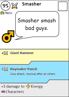
1> Put on the TOP-LEFT Hand side the amount of Health of each character which VARIES per character (think 25 to 100).

2> Next to it the HP place the "Character Type".

Keep the most IMPORTANT information on the TOP-LEFT.

3> Get rid of the tracks and on the TOP-RIGHT place a blank square with the CURRENT Health Value.

***

That previously is some aesthetic changes (like or dislike) which I am sharing. You don't have to do it... Just think about it. And if you have sleeves you can go to Staples and buy a Dry-Erase Marker/Pen for $2.00.

***

Getting back to TEAMWORK and COMBOS (as I had previously mentioned). My ideas go something like this:

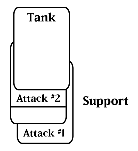
A> You can only have ONE (1) ACTIVE character in PLAY, the others are SUPPORT characters and you may have three (3) or four (4). Playtesting this will determine what is best. I personally think three (3) is enough...

B> In order to JOIN a skirmish and make it an "EPIC BATTLE", you can play ONE (1) character with the SAME Side AND SAME Character Type (per turn).

C> Place the one character JOINING the skirmish by ADDING HIS Damage to the primary characters DAMAGE. So "Damage #1" + "Damage #2"

D> You can STACK at most 3 characters according to these rules. So primary + 2 characters "underneath" the TANK.

***

That's like some SUPER COMBOS and it will help RE-FOCUS the game a bit. Now I have some other suggestion. Instead of 10 to -5... You can have MORE HEALTH.

Think 25 to 100... COMBO-ING would be ESSENTIAL to win an EPIC BATTLE!!! It's no longer a skirmish; the more teamwork you have, the greater the odds to WIN.

***

Your PARTY WINS together and dies together too. So you want a STRONG TANK and cards that you can use to complement the tank with perhaps RANGED modifier, etc. Interruptions and all that COOL JAZZ you already have.

Again I'm NOT poo-poo-ing on your game. I'm offering some CLEVER ideas that MIGHT improve the game.

As usual feel free to use/adapt/ignore my feedback... Right now this is all that I have. But it could be a good starting point to see if you can STREAMLINE the game and offer some more VARIABILITY.

Please don't be offended that I'm offering up very "core" design issues. Like I said, I'm offering the advice ... You are free to do with it AS YOU LIKE!

Cheers.

questccg
questccg's picture
Offline
Joined: 04/16/2011
I only worked with the PNP file (not hi-res)

Here's what I mean. So when you play add a Hero to the STACK, you align BELOW this sample and determine the ATTACK OPTION you COMBO with.

So I could use EITHER of these PLUS Goodknight's "Bow of Light" or "Sword of Light" depending HOW I stack the cards (beneath Smasher as being the TANK).

It's not complicated ... Let me show you what I mean:

So the idea is to have a TANK and allow the cards beneath to SHOW the ATTACKS that may be COMBO-ED. Again just sharing some thoughts...

And basically when you ATTACK you ADD up the CURRENT ATTACK from the TANK and all of the SECONDARY ATTACKS too (#1 and #2) and the TOTAL is the amount of DAMAGE that you deal... So maybe 10+ Damage.

questccg
questccg's picture
Offline
Joined: 04/16/2011
Again you can ignore if the ideas are NOT to your "liking"!

This is one thing that BOTHERS me about "Pokemon", you can ONLY have ONE (1) Pokemon active at one time.

Since your Super Hero game seems to be IMPROVING upon those other Card Games (Pokemon, Yu-Gi-Oh! and Magic), this support concept may not be new... But I have currently never seen this kind of COMBO-ING!

So it makes it very NOVEL and NEW and TBH it's not a big departure from what you ALREADY have. Sure you may need to re-organize some cards (if you try it and like it...) I just thought that to go from a skirmish to an EPIC BATTLE ... Would require some TEAMWORK!

Cheers... No worries if this is not to your liking.

questccg
questccg's picture
Offline
Joined: 04/16/2011
Also your TANK doesn't need to be STRONG to be a TANK!

You could use SUPPORT characters which can HEAL, BUFF and DEFLECT DAMAGE... And so the TEAM is stronger too. Maybe your previous BUG of not having "skin in the game" is good and beneficial to TEAMWORK. The idea is that you need to strike a balance between the TANKs that can work with SUPPORT characters that can heal, etc. And the TANKs that are naturally STRONGER (like "Smasher").

So a TANK with 45 HP could be a MENTAL TANK that "Tude" can HEAL... Making this TANK difficult to defeat but in a DIFFERENT way.

Could set-up some interesting SYNERGIES and COMBOS on how these cards work together. And it can be DIFFERENT too. What works for one "Character Type" is different than another.

Again just a couple of extra IDEAS and talking about the TEAMWORK and/or COMBO-ING.

questccg
questccg's picture
Offline
Joined: 04/16/2011
It introduces a NEW "aspect" to the game...

Now all of a SUDDEN you have "Support" Characters to your TEAM. You can have counters that prevent a Support Character from using a HEAL ability (for example) or you have an ability that BLOCKS one Support Character from joining the fray.

And those can be NEW "special abilities". I find that BONUSES are good like "+3 against Mental characters" but is perhaps too repetitive if all Heroes have the same bonus but different "terms".

Again this is just speculative and helping you get some additional IDEAS.

I know you put out the PnP files with all the cards and such. And that is fine. I'm just sharing with you the IDEAS that I am getting while pondering about your design and how you can introduce more variability to it... And just maybe improve upon the current version.

Best!

questccg
questccg's picture
Offline
Joined: 04/16/2011
Something to consider

FrankM wrote:
...My two sons enjoy the game, and they pretty much forced me to come up with three-player rules so that we could all play at once. I hope that you enjoy playing it, too...

Having 3-Players is excellent for the STACKING! Why(?) Because in effect what you are doing by doing some TEAMWORK of your own allows you to be better equipped in situations where there is a 2-against-1 situation.

So while you have a STACK or 2 or 3 Heroes, your opponents main only have simple villains or greys to counter. As such it is natural for them to COMBINE their forces to "gang-up" against Dad!

And this is 100% natural and acceptable. And if you get "3" vs. "2" and "1" the odds are again BALANCED with you being the bad-@ss TEAM vs. your sons...

Again just sharing some relatable information about having TEAMWORK.

Anyways ... This by no means is a required EDIT. Just something to ponder about and maybe test a few cards in some situations and see that it really ISN'T that much more different, it is a relatively small change ... But it may hold a lot of VALUE.

Feel free to use/adapt/ignore the content offered up in these few comments.

Cheers @FrankM!

FrankM
Offline
Joined: 01/27/2017
Power-Up Combo!

Thanks for taking a closer look, I really appreciate it. Let me explain where I started with the idea, and we'll go on from there.

What I have in mind is a relatively open field with a bunch of people on each side -- not unlike a five-on-five brawl outside of a bar -- where people pair off briefly to trade shots, then can pivot to fight an opponent of their choosing for the next go-around. In that kind of setting, it might seem "unsporting" to team-up on someone... though it is allowed in the Optional Rules (currently only a Villain can buff a teammate's attack, though the buffed teammate need not be a Villain himself).

While Villains can Gang Up on someone, Heroes can Rescue a knocked-out teammate, and Grays can Thwart an attack (prevent a fighting pair from doing any damage to each other).

The reason that Ganging Up is so abstract (teammate does +2 damage) is because I don't want to get into the nitty-gritty of which powers complement which. I really don't want this to turn into MtG with verbose rules printed on the cards.

That said, your point that a lot of the abilities seem fill-in-the-blank is valid too! A more varied set of notes than +3 vs this or -3 from that will take a step away from the underlying rock-paper-scissors of Physical-Energy-Mental. Everybody's unique "snowflake" character attributes aren't the problem: "snowflake" rules are.

Among those varied abilities could be more hitpoints. It wouldn't be stated outright on the card; the track would simply start at a higher number (in the same way that Fat Chance's ability of "+1 damage to any attack" is silently embedded into his attack descriptions).

I think the next version will retain the clips for now. A late-round combat could involve half a dozen or more cards moved into overlapping positions, and there needs to be a way of distinguishing who owns a card and what they declared they will do this round. Clips in three different colors accomplish that. Three different dry-erase markers might, too. (The Game Crafter sells fine-tipped markers in red, green, and blue... which cost out to approximately the same as including ten each of three colors of clips.)

Thing is, right now I have the clips and don't have the markers :)

I'll keep the stacking/combo ideas in mind, though. I want to bring in as much of a comicbook slugfest feel as possible, in which combos fit nicely, without bringing an RPG's worth of rules to the card text. (Do two cold-based attacks stack as well as a cold one and a fire one? Does a ranged attack have to "wait" to stack with a regular attack? etc. etc.)

FrankM
Offline
Joined: 01/27/2017
A little closer to the card concept

I have not been able to convince Midjourney to do anything in a comicbook style illustration, so pretend this looks cartoony :)

https://www.dropbox.com/s/621aht5iwbgqnr5/Tude_scratch3.png

I'm leaning toward the health on the left since that will vary by character, and it's more important to see in your hand.

questccg
questccg's picture
Offline
Joined: 04/16/2011
To help you with MidJourney...

Do "/settings < Enter >" and when you see your settings appear...

Click on "Niji Mode" (with a Rainbow) the default is "MJ version 4".

That should start to get you "Walt Disney" type of "cartoon characters". Use your prompt to be able to also specify a cartoonish like rendering.

Cheers!

Note #1: Also use these parameters AFTER your prompt to get MidJourney to perform BETTER for your type of illustrations:

::5 Whimsical character design::4 Tags: creative, expressive, detailed, colorful, stylized anatomy, high-quality, digital art, 3D rendering, stylized, unique, award-winning, Adobe Photoshop, 3D Studio Max, V-Ray, playful, fantastical::2 plain background, simple, deformed::-2

Try it without the above control statements and try it WITH them and see what works better. Those are the control statements for "Cartoon". You have to experiment a bit.

If I explain a bit. Your PROMPT will be "::5" Level 5 is priority. Next "Whimsical character design::4" Level 4. Then some Tags Level 2 and some poor backgrounds are Level -2.

Goodluck with MidJourney and getting Cartoon-like characters! I never tried but I did try Niji mode to see what it produces... And it produces CHARACTERS over the Renderings that I had been doing.

Note #2: If you want some additional control you can use these parameters AFTER The "Control Statements" (above in blue):

--seed 1 (or another value in the event that you want to be able to recreate the art)

--ar 16:9 (Aspect Ratio and specify the Horizontal by (":") vertical scaling)

That's all I got for MidJourney... No additional information for you. I've shared every I know about the AI Art creation platform. It's up to YOU to "experiment"...

One thing of VALUE which I DON'T know how to do is using your OWN IMAGE as a SOURCE for MJ. I know it is possible... But I'm just not sure HOW TBH... You should try googling for this information if it is relevant to what you feel like doing. Cheers!

FrankM
Offline
Joined: 01/27/2017
That's extremely helpful!

Thank you very much! The best model image I have for this particular character has a bunch of people in the background, and try as I might I couldn't get MidJourney to remove them (it even altered them so that they all followed my directive "open mouth yelling" which came out extremely weird).

I'll probably use up the rest of my free trial points on getting this one character right.

questccg
questccg's picture
Offline
Joined: 04/16/2011
Something I've seen too... For cartoons

Use in the prompt at the VERY END: "anime style".

That might make some MORE cartoon-ish characters... Again it's about experimentation and getting the art you WANT and LIKE.

so prompt " ... anime style::5 ... --seed 1"

Sincerely.

Note #1: I wonder what would happen if you put:

/imagine "... Superhero anime style::5 ... --seed 1"

If you specify the "Superhero" AND "anime style"... Plus all the rest of the settings in Niji Mode...???

FrankM
Offline
Joined: 01/27/2017
Will have to use something else

Thanks for all of the tips, but Midjourney doesn't seem to be able to draw specific costume elements.

The last prompt I tried was (in Niji mode)

https://d1ldvf68ux039x.cloudfront.net/thumbs/photos/1508/2102540/1000w_q95.jpg candid portrait of an African American man, standing alone in front of a brick wall::5 he wears a Marine Corps drill instructor uniform, open mouth yelling::5 green drill sergeant hat::4 khaki shirt, green pants::3 medium shot, waist shot, creative, expressive, detailed, stylized anatomy, high-quality, anime style, stylized, award-winning::2 plain background, simple, deformed::-2 --seed 8888

and like all the others the hat was... deformed... and the uniform elements scrambled. Only about half of the images have the clearly described khaki shirt and green pants. I could use it as a concept for someone else to draw the guy, but even for a prototype the artwork is more distracting than useful.

The other model image I have has people in the background, and Midjourney has a religious aversion to removing them.

FrankM
Offline
Joined: 01/27/2017
A non-terrible result

Okay, I didn't actually give up completely on Midjourney.

I did get an image that, while still not quite matching the prompt, is at least usable.

https://www.dropbox.com/s/1ker1pm2zase5os/Tude_scratch6.png?dl=0

questccg
questccg's picture
Offline
Joined: 04/16/2011
Hmm... I know MJ can be frustrating to get the RIGHT results!

Yeah that "character" looks better ... But the LEFT eye (of the character) seems a bit ODD. Like it's a LAZY eye or something.

To me, it's OK... But nothing great TBH. Like I said, there are oddities made by MJ sometimes and you ... wonder?!

I have this in a Beautiful Monster Card called the "Witch Doctor". The card art is beautiful, my ex-boss was like "Holy F-!" It's really nice. But his LEFT HAND is missing a THUMB! Go figure?!

I had to manually PHOTOSHOP the left hand to make it more presentable. So yeah NOT perfect and definitely hard to get the right prompts.

Best of luck(!?) with MJ... I shared with you everything that I know. So I think it's up to you to experiment and figure out what is best. I know it's very frustrating... But all it takes up is some of your time ATM. You're not a paying customer so... It's okay to get one FREE illustration given the whole imperfections that occur with MJ.

FrankM
Offline
Joined: 01/27/2017
Hands are Hard

All of the image generators seem to have trouble with hands, or more specifically fingers.

When you look through the training image sets, if you see a finger you almost always see other fingers near it. So when the machine decides a finger belongs somewhere, it seeds a bunch of other fingers nearby, and sometimes those spawn another generation of fingers, giving some horrendous results.

I never intended to use these images for production anyway, though I was hoping for something non-terrible for prototyping.

As for Tude's left eye, it's probably twitching in rage :) [In reality, the hat is misaligned with the head, causing some sloppy connections.]

Though I'll make additional images as I have time, the next real tasks are:

* Differentiate the starting health totals, balanced with offsetting changes to the character's other stats.
* Make icons that aren't standard emojis.

Thanks for looking, and for all your help!

questccg
questccg's picture
Offline
Joined: 04/16/2011
Some avenues to explore for ICONS

FrankM wrote:
* Make icons that aren't standard emojis.

A lot of designers use and ask for custom icons from: https://game-icons.net

I'm not saying those icons are DEFINITIVE... But there are over 4,000+ icons that you can use just simply giving credit to the AUTHORS in your rulebook. They are very generous in that way.

A lot of BGDF.com designers use them as a source for inspiration. You can go with a Black & White icon and render it using shades of GRAY and you'll land up with pretty nice icons.

Also another Art & Graphic Designer on BGDF.com is good with card templates and he can make you CUSTOM ICONS at relatively affordable prices. This is just something for you to take a look and see if anything feels like it MIGHT be useful. Unknown Depths at: https://manifestationccs.com

You'll see some already available icons from the menu bar... Take a look at those... But you can always reach out to "Nun Kwon" the Team Lead and I'm sure he can help you with personalized icons.

Again just giving you some additional avenues to check out! I too struggle to find the right resources for my own project... But these are some staples to explore further.

Cheers @FrankM.

questccg
questccg's picture
Offline
Joined: 04/16/2011
Any luck with some of those "resources"???

Just curious if you had the time to checking the two (2) links I provided??? Was this at all "beneficial"?? Did you see anything that could be in the direction that you wanted to go in?

I know people "request" icons from game-icons.net and I don't know what the rate of producing those icons is... I'm sure if you donated a bit of monies, maybe they can make some specific to your needs.

In the other thread, designers are talking about AI Art an such ... But maybe $100 USD for a dozen or so icons is not the end of the world. I know people are talking about FREE resources like MidJourney, Stable Diffusion, Firefly, et al. But if you talk in perspective to having your OWN icons made (specific to your needs ... Well then I feel like that rate is not unrealistic).

I mean I know with AI Generated art, we're talking about more affordable pricing. But is it all fair to the talented artists who are supposed to compete with these platforms?!?!

And then you have ICON people who do just that... I'm sure you could get REALLY NICE icons for $100 USD and you know that they are custom to you. And realistically that can be more of a symbolic gesture (to donate some monies).

Again I know about the AI generated content... But as an option it's something to consider. I know we all want the LOWEST possible OVERHEAD as possible. The question is: "How much better can the end product look if you invested in say custom icons???" And see the ROI or VALUE proposition...

Anyways just curious if you had the chance to check either of them out...

FrankM
Offline
Joined: 01/27/2017
Gave Game-Icons a Try

Thanks for the pointers, I gave Game-Icons a try and these are what I came up with:

https://www.dropbox.com/s/eeghjhrs77nyy7w/Card%20Icons%20Light.png?dl=0

https://www.dropbox.com/s/e8czm9lkh81s442/Card%20Icons%20Dark.png?dl=0

(Haven't had time to resurrect my Photobucket yet, so still links rather than embedded images.)

The first column are card types: Character, Condition, Interruption
Second column are sides: Hero, Gray, Villain
Third & fourth are attack types: Physical, Mental, Fate, Energy

Not bad for $0 :)

questccg
questccg's picture
Offline
Joined: 04/16/2011
Again these are ONLY suggestions... Feel free to ignore!

So for Heroes, I would make a Shield like in the "Physical" Attack (but ONLY the SHIELD) and place an "Stylized S" inside it... With Red and Blue colors. Kind of like the Superman Logo (but not as obvious)! And no "swords", just the shield.

For Villains, I would use the HEX with a SKULL in it. And make it Black and Purple colors.

For Gray, I would use a ROUND SHIELD, with a SPIKE in the middle. Like this SHIELD: https://game-icons.net/1x1/delapouite/viking-shield.html

For the Character icon... I think I would make it like "Robin's" Green MASK COLOR... I've never seen anyone else with this kind of MOST OBVIOUS choice for a Green face mask. Like a very VIVID GREEN (like Robin from Batman & Robin).

World Icon and Interrupt Icons look GREAT!

That's enough for now... I will think about the other icons (for attack types). I'd like to feel for some kind of unicity to those logos. Not sure... Will think about this some more.

Again feel free to use/ignore/adapt whatever ideas you like and reject those that you do not see as fit or appropriate.

Cheers!

questccg
questccg's picture
Offline
Joined: 04/16/2011
Something to think about...

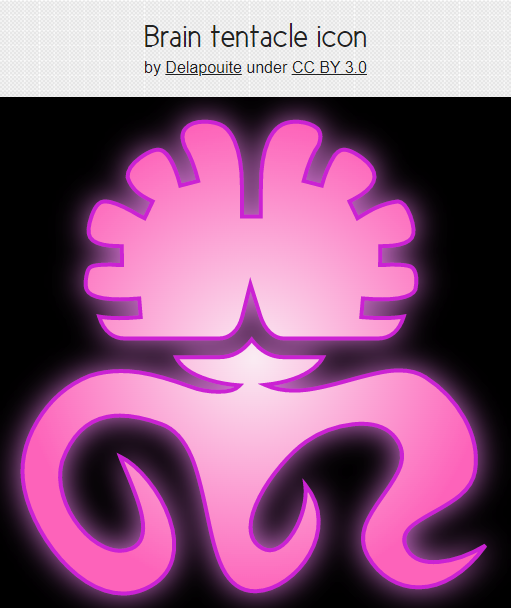
Here I will show you what I did with this ICON and you'll see it's all about matching colors, gradients, glows, and contours to make the ICON "POP"!

That's how I would expect to RENDER the Icons... And BTW I did this 100% JUST on the Game-Icons.net website no photoshop, no paintshop pro... Direct.

I'm not telling you to use this icon... I'm just showing you a more "RENDERED" version of what you can do on the website.

Hope you understand... I'm just showing you HOW you can improve with multiple edits to the various colors, contours and foregrounds.

Best.

questccg
questccg's picture
Offline
Joined: 04/16/2011
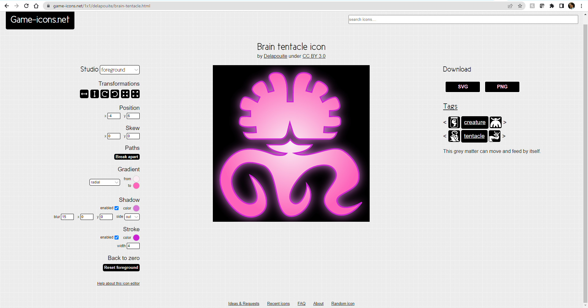
Here are the FOREGROUND instructions... For your reference

Click on the image to open a NEW Window with a larger image. All I did was do some minor changes to the FOREGROUND.

Take a look if you want to see how I did it. Again nothing complicated just some gradients, glows and contours.

If you have any questions, let me know. With this image you can play around with your other icons and compare on a WHITE or BLACK background what looks better.

Kind regards.

Note #1: If you do attempt to reproduce this "rendered" effect with the same data... Just be aware that the GLOW looks better on BLACK than it does on WHITE. You may need to TWEAK the colors of the glow on a white background.

Like I said, I'm not forcing anything ... I'm just showing what could be possible beyond simple colors... Using all the tools on the Game-Icon.net website ... You should be able to create very impressionable icons for your game.

FrankM
Offline
Joined: 01/27/2017
If icon do it, so can you

Thanks for the feedback. Some of the icons had some modifications from the game-icons website (for example, the Hero is a "rounded star" with an inverted 5-point star background).

The globe for Condition is monochrome with a circular background and a frame. A size 22 frame was a smidge too small, and 23 a smidge too big. Wonder of wonders, it accepted 22.5 as a size and it worked!

I used Inkscape to edit the SVG files for two of them: removed one shard from the Energy icon, and split the base from the arms of the Fate icon.

Then I used Gimp to put the dark or light borders on them, and also a 50%-opacity shadow on half of the Condition icon.

There is a unifying theme for each type, but obviously not obvious enough. Character type icons have a white core and attack icons have a black core. Needs stronger theming.

The Hero/Gray/Villain icons aren't supposed to look like any specific Hero, Gray, or Villain, which is why I shied away from complex shapes like skulls. There are definitely other ideas to try out for them, though, like your shield idea. The current pain point is the search engine for game-icons, or more precisely the random names and descriptions they give to their icons that make search difficult.

If I use a shield for Hero, then Physical will need to be just weapons, or a fist, or something. I'll keep looking.

Next major step is figuring out Nandeck :)

FrankM
Offline
Joined: 01/27/2017
Take Two

Well, actually Take Three if you count the original emojis in the PnP.

I found out that PhotoBucket wants at least $10 a month for image hosting, so I'll continue putting Dropbox links in this thread :)

https://www.dropbox.com/s/ul0ytyzbgwv4oio/Card%20Icons%20Dark%202.png?dl=0

https://www.dropbox.com/s/uwf0shqgy48cfx8/Card%20Icons%20Light%202.png?dl=0

First column: Hero, Gray, Villain
Second column: Character card, Condition card, Interruption card
Third column: Physical attack, Mental attack
Fourth column: Energy attack, Fate attack

I think the Physical one is too busy compared to the others, so I'm looking for a simpler rifle model to rebuild that one.

Getting any closer to a usable system?

Meanwhile, I've varied the health levels of the characters and adjusted their other stats to compensate. When I've mostly-settled on icons, and figured out how to tame Nandeck, I'll repost the PnP.

Edit: Redid the Physical icon and the Gray icon as well, still located at the same links.

questccg
questccg's picture
Offline
Joined: 04/16/2011
How about this???

FrankM wrote:
...I found out that PhotoBucket wants at least $10 a month for image hosting, so I'll continue putting Dropbox links in this thread :)

Maybe you can TRY "Instagram"! I know that "Instagram" allows you to HOST all kinds of IMAGES. One of my artist uses it... She's got like over 100k followers. You probably don't need it for followers ... Just to share images on the Internet.

I know you can't view many images unless you have your OWN account which is FREAKEN "dumb" ... I just want to see what people are doing ... Not register for my OWN "Instagram" account...

But it might work for you (in your case)... Try it... See if it works or not.

I'm not 100% sure if it does. I don't have an "Instagram" account ... But hey, like I said, it may be what you were looking for: Free Hosting of Images online.

Best!

UPDATE: I've tried Instagram and it is NOT possible to easily EMBED images from their website. It produces HTML code with Javascript, etc. And is not just an < img src="URL" >< /img >. Which means it's pure GARBAGE for allowing images to be shown.

You could TRY: https://neocities.org/

Maybe they would allow for FREE WEBSITES and paths off the main folder for IMAGES and such. I think @let-off studios has used this in the PAST... Try it and let me know!

Syndicate content


forum | by Dr. Radut