Skip to Content
 

SpellMasters — Which color do you prefer?

26 replies [Last post]
questccg
questccg's picture
Offline
Joined: 04/16/2011

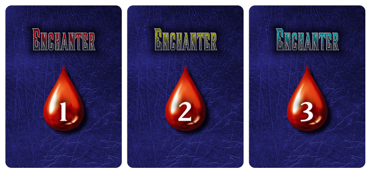
Which COLOR SCHEME do you prefer???

Some background, the color used on the BOX is the RED (#1). The color used on the GAME BOARDS is YELLOW (#2). The third color CYAN (#3) was just added because I knew it could look good.

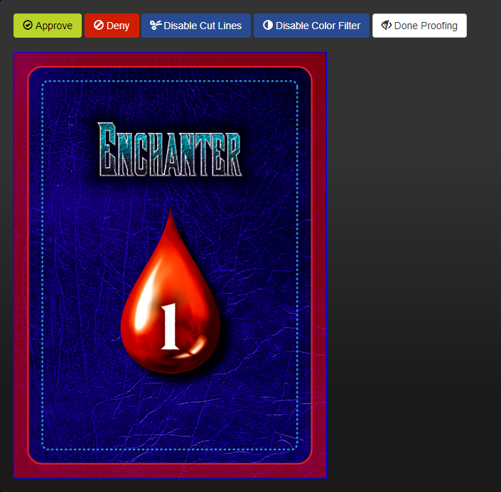
Also you can click on the image and it will pop-up a new TAB with larger sized preview...

Note: Some additional background, one of these cardbacks will be used as the "Health Point" (HP) tracker so the various classes of Wizards in the game.

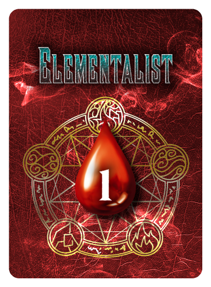
The reason I didn't want to go RED (#1) was because there is a card and class (Elementalist) which is RED. And so I was experimenting with other colors and came up with the YELLOW (#2) and CYAN (#3). Neither of those are used to represent the colors of a Wizard class...

The Wizard class colors are: Red, Green, Blue, Purple and Gray.

questccg
questccg's picture
Offline
Joined: 04/16/2011
Bump!

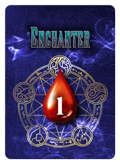
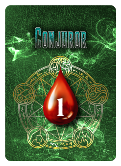
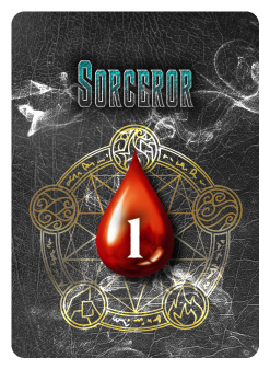
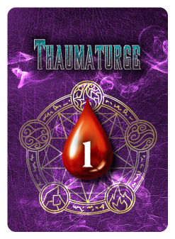
Anyone got impressions or feedback concerning the "color-scheme" in this set of "cardbacks"??? This is literally the BACK of the "Spell" Cards in the game... So the face of each of these cards should be some kind of magical Spell, component or item (depending on the Class of Wizards).

Jay103
Jay103's picture
Offline
Joined: 01/23/2018
The cyan one. I felt the

The cyan one. I felt the red/blue blended too much, and the yellow was too high contrast. Cyan was "just right".

Not super crazy about the LOGO, because the letters are very close together and hard to read, but that might just be an issue with the low resolution.

Tim Edwards
Offline
Joined: 07/30/2015
I agree. Cyan. It's

I agree. Cyan.

It's distinguishable but mysterious.

MAR
MAR's picture
Offline
Joined: 04/23/2017
Yellow stands out better, red

Yellow stands out better, red is my preferred color, and cyan matched the best. Pretty evenly split here. I'm more concerned about the font because it makes it hard to read since the letters are smashed together. Maybe a different font will make one color option stick out more?

MAR

questccg
questccg's picture
Offline
Joined: 04/16/2011
Low-res images

These are only Low-resolution images. I don't upload 300 DPI images for several reasons:

1. Copyright.
2. File size.
3. Required Scaling.

So yeah they're not the greatest images ... but they do give you an overall "FEEL" to the cards. On The Game Crafter, I have proofed some SAMPLE HI-RES images and they look a lot better.

Thanks for the feedback... It seems like CYAN is the best choice (I too was personally leaning that way too...) So I'll use that color for the cardbacks with the Health Points (HPs).

Many thanks for giving your opinion!

Jay103
Jay103's picture
Offline
Joined: 01/23/2018
questccg wrote:1.

questccg wrote:

1. Copyright.
2. File size.
3. Required Scaling.

Well, I assume you own the copyright, and that logo can't be much above 400x120 at full res, but that's up to you :)

questccg
questccg's picture
Offline
Joined: 04/16/2011
The resolution is just a bit higher

jay103 wrote:
Well, I assume you own the copyright, and that logo can't be much above 400x120 at full res, but that's up to you :)

It's actually 600px x 330px (at 300 DPI). And yes I do own the copyright, but I don't want to put the LARGER files because they would overload my hosting account for all those "linked" images. The smaller, the better.

And there is really no reason to post HI-RES images... when the impression of the images is sufficient to give an idea as to the basic layout and "feel" for the various assets/elements.

Cheers!

Jay103
Jay103's picture
Offline
Joined: 01/23/2018
Oh sure.. this wasn't about

Oh sure.. this wasn't about the cards, but the logo itself. Two of us said it was hard to read because the letters seemed squished together, but thought that maybe it was an issue of resolution.

questccg
questccg's picture
Offline
Joined: 04/16/2011
You are correct!

Jay103 wrote:
...Two of us said it was hard to read because the letters seemed squished together, but thought that maybe it was an issue of resolution.

You are exactly correct! It is the resolution. The card samples (most of the images I upload) are screen captures at 72 DPI. So they are pretty lousy in terms of details and magnification. Basically the image is the top most resolution as seen on the screen.

Any additional magnification will lead to pixellisation.

So YUP it's because of the poor resolution. I have proofed the Cardbacks (some samples only) on The Game Crafter and the resolution is BETTER but still not at 100% 300 DPI... Maybe closer to 150 DPI which is about TWICE screen resolution (at 72 DPI).

Here's a TGC "screen capture"... You'll notice a bit better quality, so I am assuming the resolution should be around 150 DPI. You can CLICK on the image and it will open up a LARGER image with even better resolution:

And remember that's still NOT 300 DPI (like I said maybe HALF). So from the screen resolution (72 DPI) to print quality is about a 4X factor. I'm pretty sure it looks fine, because if I ZOOM into the image to 100% in PaintShop Pro, the kerning is automatic... If I set it manually to about 15, there is even more spacing that makes the font most readable.

I'll reword all those cardbacks with the manual kerning to be sure there is enough space at that font's resolution.

But thanks for pointing that out... I'll make the corrections and upload a newer sample for the comparison (we'll see how that turns out).

Jay103
Jay103's picture
Offline
Joined: 01/23/2018
questccg wrote:So YUP it's

questccg wrote:
So YUP it's because of the poor resolution. I have proofed the Cardbacks (some samples only) on The Game Crafter and the resolution is BETTER but still not at 100% 300 DPI... Maybe closer to 150 DPI which is about TWICE screen resolution (at 72 DPI).

Can probably just head to Staples or whatever and find out for a dollar :)

wob
Offline
Joined: 06/09/2017
i like the cyan. no

i like the cyan. no particular reason.

I Will Never Gr...
I Will Never Grow Up Gaming's picture
Offline
Joined: 04/23/2015
Cyan - with less texture

I like the cyan (not too much contrast, but enough that it's visible) but I would consider making the texture on the text lighter/lower contrast .. I think that's a large part of what's making it harder to read (combined with a tight kerning), not the resolution of the image.

questccg
questccg's picture
Offline
Joined: 04/16/2011
The NEW sample is manual

If you check out the difference now, the Kerning is MANUAL and set at 15 (whatever type of unit that is). Anyhow it looks much better in that the letters are not so "glued" to each other... There is some spacing making the font more readable.

Compare OLD:

Versus NEW:

Open them up in two (2) separate TABS and you will really NOTICE the difference.

Cheers!

Jordan Laine
Offline
Joined: 09/23/2018
questccg wrote:If you check

questccg wrote:
If you check out the difference now, the Kerning is MANUAL and set at 15 (whatever type of unit that is). Anyhow it looks much better in that the letters are no so "glued" to each other... There is some spacing making the font more readable.

Open them up in two (2) separate TABS and you will really NOTICE the difference.

Cheers!

Is that font size part of a style guide for the game? Even after looking at it at print size, I'd make it a little larger on the card. That font isn't super friendly to read so you will have to go out of your way to help the brain interpret it (like messing with kerning, which is usually measured in points https://graphicdesign.stackexchange.com/questions/199/point-vs-pixel-wha...). Try enlarging the text by a few points if you aren't locked in because of design elements elsewhere.

Oh and I like red the best but having a wizard class that's also red might lead to some assumptions from new players about ownership of the spells.

questccg
questccg's picture
Offline
Joined: 04/16/2011
Here's a LARGER version (in RED too)

I'd recommend opening it in a NEW TAB... The White makes it harder on the eyes than if you choose to view it on a darker background. You can simply CLICK on the image and it'll open up a new tab with the image.

And yes "manually" kerning the font has made it much more readable.

Note: This is main reason that I did NOT want to use RED ON RED. You can see that the "cyan" is still very distinguishable but that "red" would clash with the background of this card. "Cyan" isn't too hot on "Green" but it is better than the RED ON RED.

Jordan Laine
Offline
Joined: 09/23/2018
questccg wrote:I'd recommend

questccg wrote:
I'd recommend opening it in a NEW TAB... The White makes it harder on the eyes than if you choose to view it on a darker background. You can simply CLICK on the image and it'll open up a new tab with the image.

Yup, I did that :) Yeah that red isn't a great option here for your bkg. Seems like you can change the color of the Wizard if you wanted to use red here, or you could go more neutral colors like a leather #5b3521 and a gold #CB8E16 then play with their saturation and brightness.

questccg
questccg's picture
Offline
Joined: 04/16/2011
The REAL problem is...

The Game Crafter (TGC). I make all my prototypes off of TGC. But they have a limited set of Pouches... I need those Pouches for the "Game Tiles" used by the game.

They come in the following colors: Red, Green, Blue, Purple, Gray and Brown.

Red and Brown are too close in terms of colors. So either I use RED or BROWN.

They used to SELL "Black" Pouches... but they are OUT-OF-STOCK.

So I want to make sure the "Game Tiles" MATCH closely the color of the "Game Tiles" and the "Letter Boards". Obviously with limited choices, I am forced to work with THEIR inventory to make prototypes that are reasonably "immersive".

What I am trying to say is that when I "submit" my game to a Publisher... I want them to say: "Wow looks cool every Wizard with his/her own game elements..." I don't want them to say: "Whoa this looks like poor color coordination" and that they don't like the marriage of this GENRE of game.

Know what I mean??? Ugh it's an endless battle...

Fertessa
Offline
Joined: 07/18/2018
Your card back design feels

Your card back design feels very heavy. That old leather texture for the background, with that image of a fully colored and shaded drop of blood, with a thick block of text, which also has shadows makes it too visually heavy for me.

As others pointed out, the font is not easily readable. I scrolled and looked at the higher resolution one, but it's not just the kerning. The font itself is not ideal, in my opinion, for the back of a card. People's eyes should be able to glance at it quickly while shuffling and not pause to decipher what it says. While it *is* readable, I think that it could definitely be more clear.

I am not a fan of using shadow, or at least that much shadow on a card. Shadow is often used as a crutch to make certain elements on an image pop instead of fixing the fundamental design problem. Instead of putting shadow on text that's hard to see, why not make the text white, so it pops against these very dark colors you've chosen?

Why does the drop of blood need to be fully colored? Couldn't you use an outline to lighten the image? Then the outline could be black or white or the same color as the text.

I think that the text and the logo should draw equal attention on the card, so as to be balanced. Currently, it feels like there's way too much emphasis on the drop of blood. If it was an intricate image which required being scaled to a larger size to appreciate detail, then that would be understandable, but I think in your case, the text has more intricacy, and could benefit from being larger. It currently feels swallowed up by the rest of your design.

All of this is just my opinion. I'm no professional. But I do hope it helps.

questccg
questccg's picture
Offline
Joined: 04/16/2011
Please remember this is NOT final artwork

It's just PLACEHOLDER artwork for a future Publisher to consider in what some of the elements of the design could look like. To give a "feel" for the game. While I'm not the greatest "Graphic Designer", I'm just putting something out there that will eventually get RE-DESIGNED by a professional.

So this is just some "nicer" version because the opposite side (Card Faces) will be in Black & White (like all my prototypes) and there won't be too many cards. A bare minimum for only playing 3 rounds of the game.

I'm not going to develop the game to the end-goal ... because quite frankly having gone through the Publishing route... I already know what to expect when it comes down to art and design. And since I'm not advancing art ... this will be up to the publisher to FUND all the artwork. Design is replaceable and any good Publisher will have Graphic Designers that can "run circles around me" when it comes to proper design protocols, making professional looking templates, etc.

Anyhow thanks for your opinion on the cardback... But to be real honest, I'm not super sensitive on the production. It'll certainly get re-designed...

Cheers.

Note: And what I was going for with this "Carback" is something old and mysterious... That's why the darker glow, the blood drop is because this is YOUR actual Health Points. If it's a "1" that means that card is only worth 1 HP. Some cards have more HP, some have less. A good average is anywhere between 10 to 20 HP (with min at 5 and max at 25).

So that side (back) serves as a reminder about how much HP each card is worth.

Tim Edwards
Offline
Joined: 07/30/2015
Fertessa wrote:Your card back

Fertessa wrote:
Your card back design feels very heavy. That old leather texture for the background, with that image of a fully colored and shaded drop of blood, with a thick block of text, which also has shadows makes it too visually heavy for me.

As others pointed out, the font is not easily readable. I scrolled and looked at the higher resolution one, but it's not just the kerning. The font itself is not ideal, in my opinion, for the back of a card. People's eyes should be able to glance at it quickly while shuffling and not pause to decipher what it says. While it *is* readable, I think that it could definitely be more clear.

I am not a fan of using shadow, or at least that much shadow on a card. Shadow is often used as a crutch to make certain elements on an image pop instead of fixing the fundamental design problem. Instead of putting shadow on text that's hard to see, why not make the text white, so it pops against these very dark colors you've chosen?

Why does the drop of blood need to be fully colored? Couldn't you use an outline to lighten the image? Then the outline could be black or white or the same color as the text.

I think that the text and the logo should draw equal attention on the card, so as to be balanced. Currently, it feels like there's way too much emphasis on the drop of blood. If it was an intricate image which required being scaled to a larger size to appreciate detail, then that would be understandable, but I think in your case, the text has more intricacy, and could benefit from being larger. It currently feels swallowed up by the rest of your design.

All of this is just my opinion. I'm no professional. But I do hope it helps.

This was a really informative post, the like of which can really help people make better design choices. You might not be a professional, but your post reminds me of feedback we used to get from our graphic design teacher at art college. Great stuff, and very gratefully received!

Fertessa
Offline
Joined: 07/18/2018
questccg wrote:It's just

questccg wrote:
It's just PLACEHOLDER artwork for a future Publisher to consider in what some of the elements of the design could look like. To give a "feel" for the game. While I'm not the greatest "Graphic Designer", I'm just putting something out there that will eventually get RE-DESIGNED by a professional.

So this is just some "nicer" version because the opposite side (Card Faces) will be in Black & White (like all my prototypes) and there won't be too many cards. A bare minimum for only playing 3 rounds of the game.

I'm not going to develop the game to the end-goal ... because quite frankly having gone through the Publishing route... I already know what to expect when it comes down to art and design. And since I'm not advancing art ... this will be up to the publisher to FUND all the artwork. Design is replaceable and any good Publisher will have Graphic Designers that can "run circles around me" when it comes to proper design protocols, making professional looking templates, etc.

Anyhow thanks for your opinion on the cardback... But to be real honest, I'm not super sensitive on the production. It'll certainly get re-designed...

Cheers.

Note: And what I was going for with this "Carback" is something old and mysterious... That's why the darker glow, the blood drop is because this is YOUR actual Health Points. If it's a "1" that means that card is only worth 1 HP. Some cards have more HP, some have less. A good average is anywhere between 10 to 20 HP (with min at 5 and max at 25).

So that side (back) serves as a reminder about how much HP each card is worth.

In a bit confused, since you made a post requesting opinions about your design, even if it is placeholder art. The changes I suggested are well within your ability, as you already know how to change the colors, pick out a font, and pick a texture.

For the sake a playtesting and easy printing, I would hope you'd want your card as readable and light on ink as possible. If not, then that's your prerogative. It's just conflicting when you post your work for feedback. I will refrain from commenting on your work in the future, my mistake.

Fertessa
Offline
Joined: 07/18/2018
Tim Edwards wrote:Fertessa

Tim Edwards wrote:
Fertessa wrote:
Your card back design feels very heavy. That old leather texture for the background, with that image of a fully colored and shaded drop of blood, with a thick block of text, which also has shadows makes it too visually heavy for me.

As others pointed out, the font is not easily readable. I scrolled and looked at the higher resolution one, but it's not just the kerning. The font itself is not ideal, in my opinion, for the back of a card. People's eyes should be able to glance at it quickly while shuffling and not pause to decipher what it says. While it *is* readable, I think that it could definitely be more clear.

I am not a fan of using shadow, or at least that much shadow on a card. Shadow is often used as a crutch to make certain elements on an image pop instead of fixing the fundamental design problem. Instead of putting shadow on text that's hard to see, why not make the text white, so it pops against these very dark colors you've chosen?

Why does the drop of blood need to be fully colored? Couldn't you use an outline to lighten the image? Then the outline could be black or white or the same color as the text.

I think that the text and the logo should draw equal attention on the card, so as to be balanced. Currently, it feels like there's way too much emphasis on the drop of blood. If it was an intricate image which required being scaled to a larger size to appreciate detail, then that would be understandable, but I think in your case, the text has more intricacy, and could benefit from being larger. It currently feels swallowed up by the rest of your design.

All of this is just my opinion. I'm no professional. But I do hope it helps.

This was a really informative post, the like of which can really help people make better design choices. You might not be a professional, but your post reminds me of feedback we used to get from our graphic design teacher at art college. Great stuff, and very gratefully received!

Thank you for the kind words. I remember my art teacher telling us that once you graduate, the hardest thing to find will be honest critical commentary on your work, and she was right. So I try to provide that when possible, to the best of my ability. Should you ever need eyes on anything and I miss your thread, feel free to PM me and I'll take a look. :)

questccg
questccg's picture
Offline
Joined: 04/16/2011
I can play around with it all day long...

And still it will be 10% of what a REAL "Graphic Designer" can do.

Here's my vague attempt to make it LESS "heavy"... No worries if you still don't like it... Like I said it's placeholder artwork and as for the coloring, that is all handled by "The Game Crafter" (TGC), it's the SAME price if it's WHITE or BLUE... They don't care.


Again, I'm not a "Graphic Designer" so don't HATE on me! I was not offended by your comments, I happen to like the Font. Maybe the card was too "empty" because I am so poor with graphics.

Anyway if you don't like this version either... It's okay too. No worries!

Fertessa
Offline
Joined: 07/18/2018
I'm not sure why you are so

I'm not sure why you are so focused on categorizing yourself as a non-graphic designer. I don't think anyone expects you to be. It's like saying " I'm no editor" and not fixing easy grammar mistakes in your rulebook. I think with the great community tabletop gaming seems to have, you have so many resources at your disposal. YOu may not be a graphic designer, but you can ask for feedback to making improvements within your skillset. You can learn from those suggestions and apply them to future projects. You can improve, just like you improve with boardgame design.

Your most recent design tweak is proof of that. Just by making the icon smaller, it lightens the card, and adds some needed balance. The addition of the white graphic is a great way to break up the space, without making the image heavy.

As for the blooddrop, sure it can be red to signify health. I meant that the fact that it was a filled in blooddrop with gradient and details were unnecessary. With the shape and a solid red color, the idea of blood would still be conveyed. Sure it'll cost the same being printed from TGC, but just because you can use as much ink as you want, doesn't mean that you should. Similarly, just because you like the font, doesn't mean it's a good fit for your game.

Regardless, I think that this newest design is better on the eyes, and that if you want to continue to improve your design, it is well within your ability to do so. Good luck with your work.

questccg
questccg's picture
Offline
Joined: 04/16/2011
Thank you for the advice!

Fertessa wrote:
I'm not sure why you are so focused on categorizing yourself as a non-graphic designer. I don't think anyone expects you to be...

Regardless, I think that this newest design is better on the eyes, and that if you want to continue to improve your design, it is well within your ability to do so. Good luck with your work.

Okay I understood and made some more "fine-tuning". To be real honest, the FONT is not 100% what I wanted. I had a vision of what the game's Title was supposed to look like. This is as close as I could find searching for FREE fonts.

Because finding the RIGHT font is well rather difficult. I'm not well versed in types of fonts, so I don't know if it should serif, sans or medieval for that matter (LOL).

Again my reason for saying that I'm not a "Graphics Designer" is because I'm not a professional at editing computer images and doing compositions... I dabble. In my opinion, I TRY to get something CLOSE to what I would want a REAL Graphic Designer to transform... And I know Mike from Outer Limit Games, LLC is better at it that I am... He designed a super layout for our boxes (It was so nice that I got compliments from the family: "Hey it actually looks like a REAL GAME!"), the rulebooks and the cards themselves. He's not a Graphic Designer by trade... but his skills are much better than my own.

So I know what is possible (for me) and what is possible (from a professional).

Note: I added thumbnails of all four (4) additional screen captures of the other Wizard classes. You can scroll up a bit and see them along with the original "Enchanter" that I was inquiring about.

Jordan Laine
Offline
Joined: 09/23/2018
Fertessa wrote:I'm not sure

Fertessa wrote:
I'm not sure why you are so focused on categorizing yourself as a non-graphic designer. I don't think anyone expects you to be...

EXACTLY! I'm not a graphic designer by trade (or otherwise haha) either but as game designers we have to dabble in everything (math, colors, crafts, layouts, player psychology...) and in board games, Illustrator is your friend! Many many years ago as a photoshop elitist I used to scoff at illustrator, then I started making board games and now my workflow is incomplete without it. I go from dry erase cards to a printed prototype in about a day or two. It's good to know your weaknesses BUT you don't need to apologize for them if you have a plan to work around them (like you do) and it never really hurts to try and improve them. Knowing basic graphic design rules will help you in the long run as a designer as you will be more informed, can make more educated decisions, and will be able to talk more fluently to a graphic designer about what you want.

Syndicate content


forum | by Dr. Radut