Skip to Content
 

Epic Battle PnP

51 replies [Last post]
questccg
questccg's picture
Offline
Joined: 04/16/2011
Trying to see if it WORKS or not!

Yup ... It works! Just sign-up for an account, add a Folder, Upload your files and you should be good to go! Obviously you need to be UNDER the 1.0 GB space.

But with images like JPGs and so forth... Should be easy to manage.

Cheers... And Enjoy!

Note #1: Here is the Link/URL again: https://neocities.org/

It works 100% for me... And you get 1.0 GB of space with 200 GB/Month. So if you ONLY Host Images... The amount of downloads = # of images x # of views. I think it's should be okay IF you don't use the WEBSITE and ONLY Host Images.

Like I said, Enjoy!

FrankM
Offline
Joined: 01/27/2017
Testing, testing...

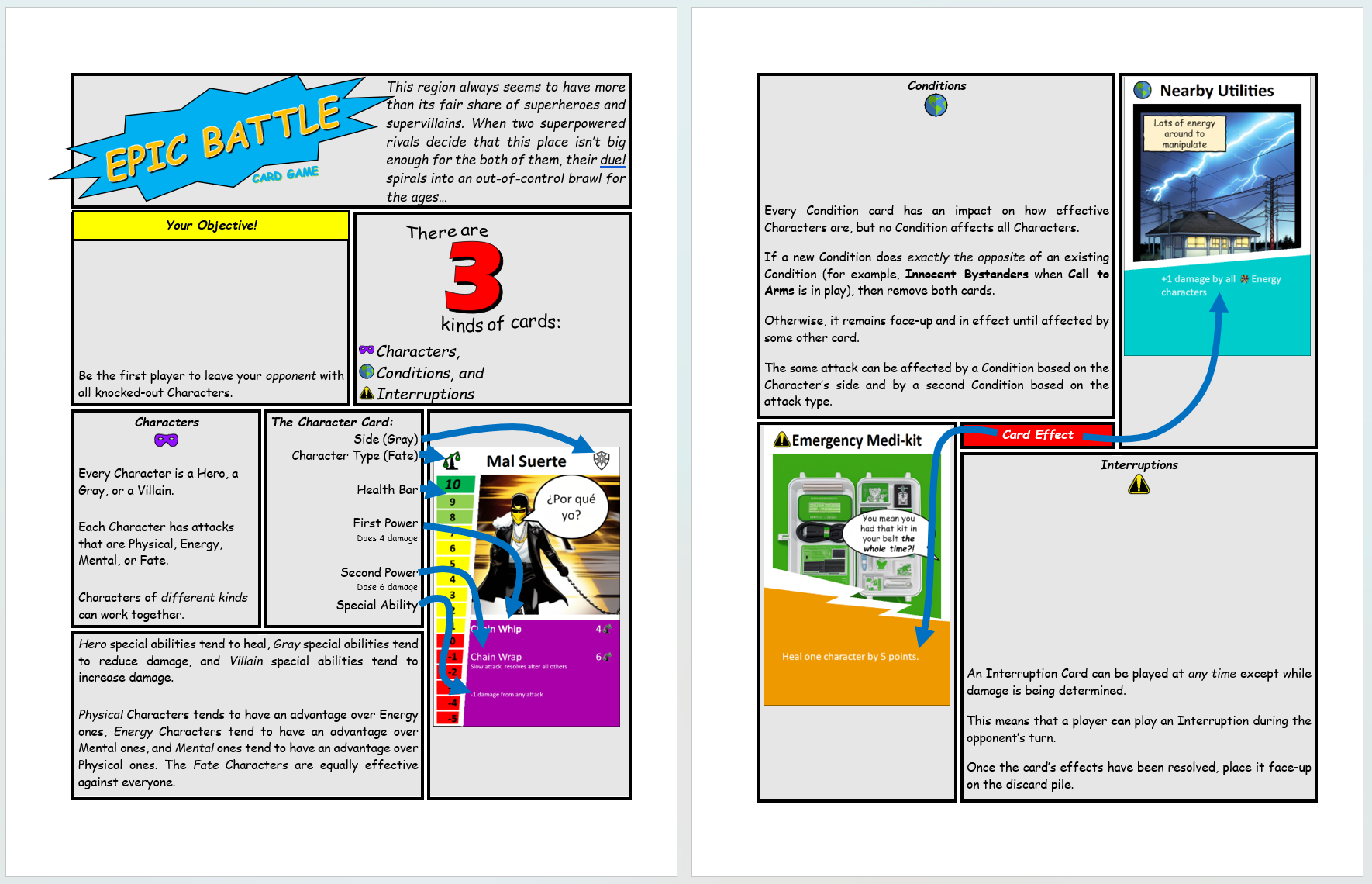
Thank you very much, that's extremely helpful.

FrankM
Offline
Joined: 01/27/2017
Booklet Test

Hello everyone, sorry I vanished for a while, have a health thing that's not playing fair.

Anyways, I think I'm going to need a graphic designer to lay out the "comic book style" rulebook, because this stuff is much harder than it looks!

(Click the image to open in a new tab.)

The card faces are Stable Diffusion because I was able to get a local instance of it running on my machine. If you have a reasonably recent NVIDIA card with at leat 8GB of VRAM, you too can download a utility called AUTOMATIC1111 and watch your computer come tantalizingly close to understanding your prompt, then veer off into left field.

I'm using a specialized model called Comic Diffusion V2 because of the art style I'm trying to emulate. There are vastly superior models for photo-like pics.

In case anyone's curious, the prompt for that dude with the chain is:

PROMPT: full body action shot of Hispanic man, black hair, (whipping a long chain:1.15), (long black coat, gray pants:1.25), (white shirt, black gloves:1.2), (yellow wrestling mask:1.15), city street, comic by Pepe Larraz

NEGATIVE PROMPT: (deformed, mutated hands and fingers:1.2), missing limbs, extra limbs, tights, symbol

I'm only using it for placeholder art anyway. These images will need to be drawn by someone eventually.

And the cards themselves are now built in Nandeck instead of mocking them up visually in PowerPoint.

questccg
questccg's picture
Offline
Joined: 04/16/2011
Okay I have some comments about this layout...

Firstly you should add PADDING to each Panel which is like 10 pixels and is WHITE.

The current separation between Panels is too THIN. Make sure the BACKGROUND of your page is WHITE. 10 Pixels is good because it's 10 per Panel so 20 pixels in-between two (2) Panels is going to look super professional too.

Also I would make the Border of the Panel to be 2px (very thin). And if you use Photoshop maybe use the Bevel Layer Style to make it kind of sunken it for each Panel.

It's a 3D Effect for a Layer. Put your Panels in separate Layers and apply the SAME Layer Style (the Bevel) to make it look better.

If you want your Panels to be gray... Use a Gradient with two (2) shades of gray. One LIGHT (#EEEEEE) and one darker (#AAAAAA) and make them diagonal in nature (but linear). Per page keep the SAME ANGLE and this will give your Panels more intricacy.

Lastly get a Font like "Classic Comic" and you can PAY for the Font if you are going to use it commercially...

Also if you want it to be MORE "Comic-like" I would use Text Bubbles and place the text in Bubbles. That too will take more time... But if you have long text you can have it in multiple Text Bubbles all connected to one another so that you read TOP-DOWN to keep some semblance of a rulebook.

If you don't understand any or some of these tips, just let me know and I'll see if I can EXPLAIN it better.

Best!

FrankM
Offline
Joined: 01/27/2017
Thank you for the advice

This was an attempt to make something that looks kinda like a comic book, knowing full well that I can't quite pull it off with the tools at my disposal.

The panels are really table cells with a think border between them, mostly to work out what needs to be where. With that in hand, I'll have to do the same thing I did for Horseman's Chess: painstakingly recreate each page using Microsoft Publisher. (Starting in July, I can get access to Adobe Creative Cloud for a discount through work, but I'm not sure I'd get much benefit from it.)

At that point, I need to position everything properly, use gradients that won't cause eye strain, and basically do everything else you mentioned. I did grab the Classic Comic font... thanks for the tip.

It might turn out that any artist who can draw these comic-book-style characters can whip up the whole booklet in a tiny fraction of the time it would take me. I'm still going to be working on it in the meantime regardless.

Once I have placeholder images and text bubbles for all 54 cards, I'll get Nandeck to give me an updated PnP. (There are some things that are really really hard to generate with Stable Diffusion.)

Rules-wise, the difference will be that characters will start with 8, 10, 12, or 15 health. I dialed back the special abilities a tad for those with higher health.

Edit: The only problem I see with Classic Comic is that it's a CAPS-ONLY font. I can use "small caps" to give the text some texture, but I'll have to see how readable it is with and without lowercase letters.

questccg
questccg's picture
Offline
Joined: 04/16/2011
Sometimes a picture is worth a 1,000 words

I'm sorry that I wasn't able to explain what I meant. This is using PaintShop Pro only... All of what I said to do is in this small sample. Again, it's not my place to do the entire layout for you, just to give you small sample of what is possible.

I'm sure you get the idea. It's a long and painstaking process... But if you want it to look GREAT... Some of my explanations may prove to be more fruitful.

Cheers.

Note #1: I spent about 45 minutes to get this to SHOW you what it COULD look like. Again using all the tips that I posted before and demonstrating that YOUR IDEA... Could be pretty cool.

Note #2: I think the BEST tool to do this in would be Adobe Illustrator (All Vector Art and you can embed icons and images). So if you get access to Illustrator ... That would be the best tool. You would have to do one (1) PAGE at a time. And I don't know if you will be able to do the Bevel Layer Effect. I think you CAN... It's just that I have never done this in Illustrator before. Photoshop and Paintshop Pro YES.

Note #3: Why I RECOMMEND Illustrator is because you can create all kinds of Bubbles (Speaking, Thinking, Multiple bubbles linking together for the 3 kinds of cards - for example)...

Like I said I did this in PaintShop Pro and the Vector shapes are VERY HARD to work with. Illustrator is a bit easier to work with... But you'll need some custom bubbles to work with and the edit to your liking. Like some SVGs... And work with those... You can google "Speech Bubbles" or "Talk Bubbles", etc.

FrankM
Offline
Joined: 01/27/2017
Looks fantastic

For 45 minutes of effort (which I didn’t deserve), that looks freakin’ awesome!

I’ve never used Illustrator, is it part of Creative Cloud?

Since MSFT Publisher feels like trying to thread a needle while wearing boxing gloves, it may turn out to be the same amount of effort to use Illustrator and get better results.

I’ll see if there’s some path to getting the software before July. It would simplify making the quote bubbles for the cards, too.

Currently still working on getting Stable Diffusion to give me card placeholder art. Some things are just outside its ability to comprehend, and those things I need to mock up in an unholy alliance of PowerPoint and GIMP. Again, a big self-imposed limitation is using a comic-book style, which limits the model’s ability to understand anything abstract. It can do an “emergency medical kit” but completely whiffed on “two bullets ricocheting off each other” (the Odd Coincidence card).

Even when SD works, it takes a couple dozen tries to get a useable image. At least it’s running locally with the only cost being negligibly higher electricity use.

questccg
questccg's picture
Offline
Joined: 04/16/2011
Why I RECOMMEND Illustrator over PaintShop Pro...

You can Google the Interwebs for "Speech Bubble SVG" or "Talk Bubble SVG" or "Think Bubble SVG" and you will fin a TON of FREE resources. All you need to do with Illustrator is to open the SVG and copy paste from that file to your PAGE LAYOUT file. Of course you need to rotate the bubble and select the nodes you want to expand (I can explain that further... when the time comes).

With PaintShop Pro you need to use the Digital Assets Pack. I'm not sure it's FREE anymore... I got it when I bought Version 18.0 of PaintShop Pro. It too requires some manipulation...

But Illustrator uses SVGs NATIVELY. You can import the Vector shapes just using OPEN and Copy & Paste to another Illustrator Window.

Illustrator is part of the Cloud Offering of Adobe. And as per Google, I found that you can use the "Bevel" Layer Option in Illustrator too.

But that SAMPLE was just to show you what it COULD look like. Tiny details like the "Bevel" and Gradients just as a level of "Pop" which makes the LAYOUT look more "real" or comic-book-like.

Glad you like it... It gives you something to work with and aspire to do!

I wanted to SHOW you what it could look like, because you seemed unconvinced about what I wrote. Sometimes a picture ... is like 1,000 words. And I really understood the "comic-book-like" feel you were going for even if the sample you showed didn't have all the bells & whistles...

Illustrator will seem very MINIMAL at first. But when you lean how to resize "Speech Bubbles" and how to play around with Vertices (left side without distorting the bubble - or right side too - one side at a time). You'll get more experience and you'll see Illustrator is easy to produce Vector Art IF you have some SVGs to go along with it.

You can also rotate the SHAPE and move the vertices where the "speech" emerges (that triangle that shows where the speech is coming from). That usually requires you to select 3 Vertices and then use SHIFT and move around to keep it aligned but move to another position...

Trust me Illustrator is the TOOL for this Comic-Book Layout. I would do 1-Page at a time and you can load/Save As to quicken the process and just reconfigure the Rectangular Panels. That part is rather easy once you have the FIRST page done... Then it comes to personalizing.

The "Speech Bubbles" may take more time ... But again I can help you with some advice and how to edit. Once you do it a couple of times, you're set for life.

The Text is no problem ... Just a case of Font selection and to make some words BOLD, you can use a COLOR like Blue or something on a word here-and-there.

Anyhow ... Hit me up when you get the tool and I'll be more than happy to help FAST-TRACK your time working in the software.

Sincerely!

Note #1: And realize that it's going to take the longest to do Page #1 and then each Page with the "Speech Bubbles" (Or "Thought Bubbles") and the text and re-laying out the Panels will take some time... But it is what it is... There is no going around it... Unless you give my sample to someone else and ask them to do it (and you pay them)... Well then it will be their time that they spend making the various layouts.

It will be "involving" but what you are trying to achieve is very UNIQUE and it will take some time... no way around it.

questccg
questccg's picture
Offline
Joined: 04/16/2011
Also ...

Instead of using the ARROWS on Page #1, you can use COLORED "Letters" ("A", "B", "C", etc.) in one Panel and then use the SAME "Letters" in the Card Panel too.

It will feel more NATURAL too... And less invasive than the arrows. You can use the COLOR "Red" (255, 0, 0 RGB) and that should allow people to understand what each letter represents and refers to in the next Panel.

I would favor this "Letter" format vs. Arrows ... Because it's easier to follow IMHO.

Cheers!

Note #1: I did ANOTHER "Panel" just as a sample. Again this is using PaintShop Pro which is limited... But allows rapid prototyping and sample making. The ideal tool is Illustrator (which I only have on a virtual box). It's a bit of a hassle to start, size and open the app and then work with a shared folder, etc. I use it when I NEED it...

The Panel #3 speech bubbles consist of ONE (1) Speech Bubble and TWO (2) Ellipses... I also drew a white line to remove the appearance of the border so that it would appear like one SOLID object as opposed to THREE (3)!

Note #2: I gave the "3" an "Outer glow" with the color White. I just didn't like how PaintShop Pro "Drop shadow" is sh!tty. It doesn't work well... In Illustrator it would be better. Plus this SAMPLE is ONLY 72 DPI which is SCREEN RESOLUTION. In Illustrator you'll get 300 DPI Print Resolution and you'll have much better finer CONTROL over the Page Layouts.

FrankM
Offline
Joined: 01/27/2017
You're a veritable gold mine :)

You're a veritable gold mine of helpful :)

I'll see about getting a license through work for Creative Cloud before the formal contract starts in July (not clear on why the long delay). In the meantime, I do have Inkscape which I used to do all the laser-cut-path SVGs for Horseman's Chess (handing off the optimizing step to svg.zuzo.co) and touch up the icons from game-icons.net.

EDIT: And that second panel looks nice. I think I'd swap the two elements left and right, but you definitely got the gist of the look I was merely hinting at with my post. Now get back to cutting your cards ;)

questccg
questccg's picture
Offline
Joined: 04/16/2011
It was just a sample since I had your icons from a previous post

I agree the "3" should be on the LEFT and the Bubbles on the RIGHT. Would FLOW much better!

I'll see about the cards... I have yet to cut them. It's been like AT LEAST a WEEK now. Usually I do them 1-2 days after printing. Slow spell... I guess. I will resume that maybe NEXT (Since I ate supper)...

Thanks for the pep-talk and I was only showing what could be done, how to make the bubbles interesting and link-up with each other instead of just ONE (1) per Panel, etc.

You can also use "Thought" Bubbles too... Wishing you all the very best with your rulebook. It's definitely a NEAT IDEA you thought of!

I actually want to WATCH some of "Season #2" of the Mandalorian on Disney+. I saved $10/mth on my Internet (25 mbps to 30 mbps for $10/mth LESS!!!) so I decided to subscribe for Disney just so I can binge some shows this month and cancel towards the end of the month.

I'm not keeping the subscription. But the 3rd Season of the Mandolian just appeared and I wanted to watch that too! Not to mention the Book of Bobba Fett that too seems interesting too! I've always been a Star Wars Fan.

Cheers!

Note #1: And take the TASK as it is: a chance to GLORIFY and BEAUTIFY your rulebook. I know it takes time doing stuff (even with the best of tools)... Just wanted to show what it could look like and give you some IDEAS you can use to make it look INTERESTING instead of just one speech bubble per Panel... I really wanted to show you how you could make it more interesting and make it FUN to read...

This sort of Layout makes it DIFFERENT and I think that's very cool. Again all the best with the rulebook.

BTW there is a way to have multiple pages in NEWER versions of Illustrator. You may want to look into that TOO. I usually only do 1-Page AT-A-TIME. But that's because I'm a bit old-skewl... When I learnt the first time, there was not such an option, only one page per file.

So I usually try to keep things as simple as possible. But there are other options ... You can export to a PDF and use Acrobat to assemble the pages and then you'll get a PDF document you can print at Staples in full color! And you can share this document (if it is still a PNP).

Again more steps. I know InDesign allows you to do multiple pages. But I would LEARN "Illustrator" first... because it's suited for VECTOR ART.

FrankM
Offline
Joined: 01/27/2017
I see you fixed the 3. Looking good.

I got to see what's in the Creative Cloud package (I have a rapport with the IT folks), and it does not include Illustrator. It does contain some "art and illustration" tool called Fresco that I'll give a look-over.

At worst I can limp along in Inkscape.

EDIT: Fresco is for people who draw/paint on a tablet. The Creative Cloud in-app "Buy" button for Illustrator says "Contact your administrator," so I'll circle back around to IT and see what gives.

EDIT2: The free previewish license didn’t have Illustrator, but IT assures me the “real” one that costs money will include the full suite. In the meantime, I could get Illustrator on my own, but I have enough other stuff to do between playtesting and battling Stable Diffusion that July might about the right timing.

questccg
questccg's picture
Offline
Joined: 04/16/2011
About the 2nd Update...

Yes ... If you are in no "RUSH" makes sense to wait. In the meantime, you can start to google "speech bubble SVG" or "talk bubble SVG" or "thought bubble SVG" and you can do multiple passes with the "free" or not. There should be whole bunch of options.

Here's one for $1.70 USD and says SVGs included:

https://www.etsy.com/ca/listing/1102688452/speech-bubble-svg-speech-bubb...

But of course I'm sure if you google more, you should be able to FIND FREE ones. I really don't have time to google them... But know that if you spend a couple dollars and get exactly what you want... For two bucks... I'd say that could be OPTION #1.

ALSO Adobe might have a SHAPES library you can search too. I work offline when I edit stuff. But I would save files LOCALLY and see if you D/L some assets from the Adobe Cloud too. I'm not sure how that WORKS (Again google is your best friend...) But that may be OPTION #2.

OPTION #3 could be googling and finding more FREE content. Like I said, if you have some time to PREPARE ... I would google now for the stuff you need. Stuff you DON'T need: Squares, Rectangles, Rounded Rectangles, Ovals, and Circles. Those all come with the standard shapes.

But the Bubbles do not come with the default shapes. That I know. But OPTION #2 might yield some free content too. If this option takes too much time, the SVGs are the next best thing. And for your purposes there are a lot of options...

Another $3.00 USD option for 130 different ones is:

https://www.etsy.com/in-en/listing/1176931393/130-speech-bubble-svg-cart...

But again you might be able to find something FREE ... If you spend more time googling around and searching for different keywords like "library" or "collection" or "set", etc.

Line thickness, "Bevel" Layer option and Gradients are all included in Illustrator. So you don't need to worry about that. You may need to create a NEW Gradient and give it a 45 Degree Angle (Like in my sample) and you can VARY it per page (I would go uniform per page just to make it not too distracting) and use the SAME ANGLE per Page. Like Page #1 uses 45 Degrees, Page #9 uses 270 Degrees, etc. And you can play around with it per page. My gradient is #AAAAAA to #EEEEEE (linear gradient given an ANGLE).

You can also TRY one angle and SEE IF you LIKE it or not. And then click on the other panels and change the angle to one you prefer (for each Panel).

The Classic Comic Font is good because it looks like comic-book writing. It is the Go-To standard for online works.

And again, if you are stuck, need some explanations or want to know how to do something, I can HELP. But I don't know everything about Illustrator, I'd say I know about 60% of that tool. For what I need it, I am okay with the knowledge that I have. And just like my "almost disaster", even I need to google for advice at times, because it seems like it doesn't always work the way I planned it to!

Best.

questccg
questccg's picture
Offline
Joined: 04/16/2011
Save your MONIES and TIME with this TRICK.

Hello @FrankM .. I know I sent you several links for SVG files. But there is an EASY way to do a "Speech Bubble"... Here's an example:

The geometry of a speech bubble. The example on the left shows the vector (Bézier) nodes of a speech bubble. The example on the right shows the nodes of the two simple shapes (an oval and a curved triangle) used to create that speech bubble.

This FREE Method is better. Because it relies ONLY on BASIC Shapes. An oval and a curved triangle... This means you can use a Rounded Rectangle or a Squared Rectangle, etc.

The key here is that it's much easier TO EDIT the TRIANGLE and reposition it than using SVGs with pre-defined vertices. See moving the vertices is HARD in PDFs.

This method of JOINING two (2) distinct shapes is FREE and very EASY.

Don't bother looking for more files. When the time comes, I can explain how to MERGE the two (2) objects into one (Union) and then you can EDIT the triangle MUCH EASIER and place it where and HOW YOU LIKE.

Cheers... Glad I dug around a bit more for you...

questccg
questccg's picture
Offline
Joined: 04/16/2011
A thought bubble (simple way)

Instead of using a curved triangle, you can use two (2) small OVALS and get the effect of a thought bubble. Okay it might not look like a "cloud" but do you REALLY NEED such complication??? Keeping it simple will keep the page clean and should be able to do most of what an SVG could with EASIER editing.

If you want some more fancier bubbles... Then google for something FREE and ensure that it is SVG. The problem is that some SVG files are MERGED and it makes it HARD to move the "triangle" or "ovals" (Thought Bubble).

The above method is TBH the BEST WAY of making them. Because EDITING such MERGED shapes is easy in Illustrator: it's creates a GROUP (merged object) and you can drill down into the object and move the "triangle" or even EDIT it's shape and direction. Much, much EASIER than working with an SVG file.

Cheers.

questccg
questccg's picture
Offline
Joined: 04/16/2011
Word of the wise...

I personally would NOT pay for a SVG library or collection because the OBJECTS may be ALREADY "merged" (joint-paths) and that means that it is VERY HARD to edit them... Even IF you have the SVG file. It highly depends on how the SVGs are structured (and SAVED).

I know creating a CLOUD shape is the HARDEST of things to do (because of all the segments and curves and such). But if you can do WITHOUT it and stick to OVALS, ROUNDED RECTANGLES and such... You won't have to worry.

Having said this, for $7.50 USD you can get a few "Cloud Bubbles" that you can use from this location:

https://www.alamy.com/cloud-speech-bubbles-great-design-for-any-purposes...

Again you can google for something FREE... Will take a bit longer and you need to avoid hand drawn or different thickness of shapes, and no drop shadows, etc.

That file shows you the TOUGHT PART: making the "clouds".

You can WAIT until July when you have the tool and figure out IF you need to have such complication or not. It may be a bit FANCIER too... And you may find the NEED for "cloud bubbles" ... But all you really need are the various CLOUDS and not the full shapes (you can add your own ovals...)

But this shows you what I meant by "smaller ovals" (under the cloud bubbles).

That you can do no problemo.. The CLOUDS are a bit TRICKY and would probably take me about 30 minutes EACH. You have to play with EACH NODE, make it a curve, play with the curve, and repeat for ALL NODES. It's a bit of a PAIN.

But drop a few BUCKS IF you REALLY NEED and WANT this type of "Bubble" is basically a PERSONAL choice. If you want fanciness for some Bubbles ... Well then THIS file I would recommend. I wouldn't recommend the ETSY ones because you simply don't know how they are MADE. This file, even if MERGED, you can DELETE the small ovals and create your own. It takes like 30 seconds.

Anyhow... Just trying to explain with some visuals ... My reasoning.

Best!

questccg
questccg's picture
Offline
Joined: 04/16/2011
My advice to you...

Is to FORGET "Clouds" and stick to basic shapes: OVALS and ROUNDED RECTANGLES.

Why?

Because even if those CLOUDS LOOK COOL and the SVG file allows you to "extract" them easily.

THE PROBLEM with them is RESIZING. If you want to resize on the HORIZONTAL level ONLY... That's going to produce "distorted clouds" (if you get what I mean).

Ovals don't have this problem and Rounded Rectangles can be RE-CREATED from scratch in 30 seconds and you'll have the right size. Which means that you don't scale Rounded Rectangles, you create them with the right size and then apply the ROUNDING. This way everything looks NORMAL and there is no distortion.

Like I said, having CLOUDS is a very big PAIN.

They look good AS-IS... But scale very poorly and distort when you resize them...

You've seen from my sample using firstly a Rounded Rectangle for Panel #2 and Ovals for Panel #3... And you can still create Ovals for Thought Bubbles... it's just simpler than having to deal with CLOUD shapes.

If you want to save yourself some aggravation and TIME. Forget the "Cloud Bubbles"... They'll just annoy you and cause frustration.

Regards.

FrankM
Offline
Joined: 01/27/2017
Thanks for all the pointers

I can use Inkscape to disassemble and reassemble multipart SVGs if Illustrator can't do that natively.

Inkscape also preserves stroke thickness even if you distort the shape, which is nice.

Inkscape also has inobvious state changes and wonky mouse selection, so it would be nice if that kind of work could be done in Illustrator. I'll use this as a way of learning Illustrator, hopefully useful for future projects as well.

questccg
questccg's picture
Offline
Joined: 04/16/2011
Also ...

FrankM wrote:
I can use Inkscape to disassemble and reassemble multipart SVGs if Illustrator can't do that natively.

You don't need to "disassemble" anything with Illustrator. If it is a MERGED object, you can access the various layers used to make the "object".

The problem is that some SVGs have only a single PATH with the object MERGED into one object with all it's vertices ONLY. This means that the OBJECT ONLY has the pre-designed VERTICES and cannot be BROKEN or DISASSEMBLE at all. Only one PATH (with all the vertices and segments).

FrankM wrote:
Inkscape also preserves stroke thickness even if you distort the shape, which is nice.

I don't think Illustrator does this. But if you have a PATH or OBJECT on a layer it is VERY easy to make the path THICKER or THINNER. There is a setting. But scaling OBJECTS in Illustrator means that some times you need to manually "fix" a path THICKNESS for example. It's not hard and is very easy to do. Maybe holding the SHIFT-Key might make a difference, IDK. I only know about 60% of Illustrator so there may be some techniques which facilitate scaling.

Quote:
Inkscape also has inobvious state changes and wonky mouse selection, so it would be nice if that kind of work could be done in Illustrator. I'll use this as a way of learning Illustrator, hopefully useful for future projects as well.

Well the only problem with Illustrator is that SOMETIMES it is HARD to SEE which VERTICES are SELECTED and those that are not. And the convert to point tool which allows you to bend and make curves has a STUPID default behavior of resetting the segment to a line (if you click on the segment instead of a vertex).

I guess all tools have their less-than-perfect performance. And they each have some kind of finnicky way of manipulate certain aspects (segments or vertices, etc.)

But yeah... What I was trying to EXPLAIN with SVGs ... Is that sometimes the way that the PATH was designed is LOST in the FINAL SHAPE. They only present the path and vertices not the layers and sub-objects used to MAKE the final shape... And then THAT is a b!tch to edit since it's pretty much USELESS because you can't do anything but delete or add vertices to a FIXED PATH.

And THAT is HARD to EDIT. I hope that explanation is more clear!

questccg
questccg's picture
Offline
Joined: 04/16/2011
Here's an UPDATED PNG file with the AI file ready for you!

Hello, I spent some time working on the Sample Layout (.ai) file for Illustrator.

Here is what it all looks like ATM:

You can click on the image if you want a LARGER preview... Let me know if you want this Illustrator File. The one in the package that I linked to you earlier (a few days ago) is not as advanced in terms of the design. This version is not complete... Because I don't have your "Sample Card" (to be in Panel #7)...

This is of course to INSPIRE you to design YOUR OWN pages ... I've just gone ahead and taken the time to SHOW you what it can look like. This is about 2-Hours of work. Not too bad TBH...

Once you have some shapes as references and created the icons (from Photoshop files - in the ZIP that I sent earlier)... It goes much quicker to create something cool looking...

In any event, let me know IF you WANT this .AI file... I'll send it via e-mail. PM-me and let me know where I can send the .AI file (updated one).

Best!

Note #1: I didn't play too much with the Bevel option in Illustrator... Not sure how it works and it made the Application CRASH... So I simply went with "grayed" outlines and NOT the Bevel-feel... For safety reasons I elected to use standard stuff and NOT mess around with the effects.

It was also causing problems with the Preview mode (which shows you what the page will look like in final-print) and so I removed all "effects". Notice the Gradients are NOT "effects" they're a color style... So I kept those.

Like I said, it took me about 2-Hours and I think it looks pretty decent.

I focused on Text/Speech Bubbles to make it FEEL more Comic-Book-Like... And I decided on LETTERS for the abilities instead of "arrows" because they are less intrusive and work with the overall design of that Panel.

I had some free-time to just want to do some editing and so I decided to TRY to layout the ENTIRE page (with the exception of the Card Sample). This gives you a GREAT starting point and I can guide you along if you need help.

Please notice that IF you WANT the .AI file (90% done!) please let me know.

Also I sent you a PM with a ZIP file with the contents of the files for Illustrator and Photoshop (icons are done in Photoshop - Transparent PNGs). This ZIP file contains the UPDATED .AI file and corresponding files (like the LOGO)...

Note #2: I'm not saying this is the BEST/ULTIMATE layout... I do have some Design-skills... I'd say I'm a 65% grade when it comes to designs... But I do have a lot of ideas... Take for example the Game's Logo. I could definitely share with you some ideas... And I wish that my skills were as good as "Mike" (RIP). He was like a 95% grade. It's such a big loss both to his family (the Stricklands) and his partners (Joe and I).

But working in Illustrator and doing more layouts, you learn and get better at it as you go. The more opportunities that you have to DESIGN a layout, the better you get at doing it.

So no worries, I count this LAYOUT as a chance to work on my own SKILLS.

And being able to translate my own THOUGHTS into something REAL is also a great way to PRACTICE and LEARN more about Illustrator (for example). So by no means is it a WASTE of time... Even if you DON'T like the layout. But I'd be very surprise that you HATE it. To me it looks good. I had to fudge with the wording in some places, in other places I used three periods ("...") to give it a speech-y feel.

Again if this is not what you are looking for, don't worry. And if you DO LIKE it ... Well feel free to use this page to create NEW ones for your rulebook!

Note #3: I did some more EXPERIMENTATION with the "Logo" ... Just a fast example. It looks cartoon-ish (Comic-book-esque)... And doing some work with the image, I managed to get something 90% looking like something "EPIC" (just like your game)!

Note #4: If you like what you see... Let me know! I'm guessing you are very busy with work and family. I fully understand. While I take a "breather" from "Monster Keep" (MK), I figured I'd do something to help someone ... You've helped me out too. So I just wanted to give you the best possible starting point from which to continue creating your rulebook!

Cheers.

FrankM
Offline
Joined: 01/27/2017
Thanks for all the advice, Quest!

The health issue I mentioned earlier came back with a vengeance, so I didn't get to implement much in the way of suggested changes. For example, card elements are still called out by arrows... though numbers are used elsewhere to help players understand sequences. It's almost like picking up this conversation where we left it back in May.

Though treatment is still very time-consuming, I've managed to get just enough ahead of work and self-care to resume things that I want to do. (I'd go absolutely bonkers if I didn't get back to work, though everything associated with it takes more time in my current condition.)

One of those things I wanted to do was taming Adobe Illustrator enough to layout a 5"x8" booklet (The Game Crafter's "large booklet") into something resembling a comicbook style. I never could figure out how to join overlapping shapes in Illustrator, so I made do with a file of SVG dialog bubbles that you recommended, distorting them as needed.

The bubbles on the cards were manipulated as raster images in Gimp, while for the booklet I used the SVG bubble as a cookie-cutter in Inkscape to create a filled-in bubble (overlap a bubble with a rectangle and use Fracture to get a shape based on the interior of the bubble that can be independently filled and outlined).

Those two processes worked well since Nandeck works with raster images and Illustrator works with SVGs. Oddly, I can't copy/paste SVG objects between Inkscape and Illustrator... had to use saved files to transfer anything between them. The 90s called and they want their workflows back.

Pasting SVG stuff into Gimp works just fine; it appears as a rasterized image that can be its own layer or blitted onto an existing layer.

In other news related to the artwork: I've taken out all of the Midjourney and Stable Diffusion images, going back to icons for everything. The overwhelming majority of icons come from game-icons.net, though I don't expect any of them to survive all the way to the end product.

I'm not philosophically opposed to using AI-generated images in a prototype (though I am in a published product), it's just that I want things to be consistent across all of the components. I can't get satisfactory images for all the components, and therefore I'm not using them for any at this stage.

Here are some of the less terrible outcomes. It seems to completely fail for most Conditions and Interruptions.

Bonesnapper (Villain)

Duke (Hero)

Fat Chance (Villain)

Just Ice (Hero)

Metalloid (Gray)

Mr. Vice (Villain)

Rock Beast (Villain)

Yuánqì (Hero)

Besides, I'm not sure how a real artist will react to seeing AI-generated placeholder artwork.

There's a new Game Journal entry for Epic Battle, but I'll repeat the core of it here.

Imagine that the large white areas of the booklet contain comicbook art of the various characters in the card deck.

Rule booklet

Cards

Syndicate content


forum | by Dr. Radut